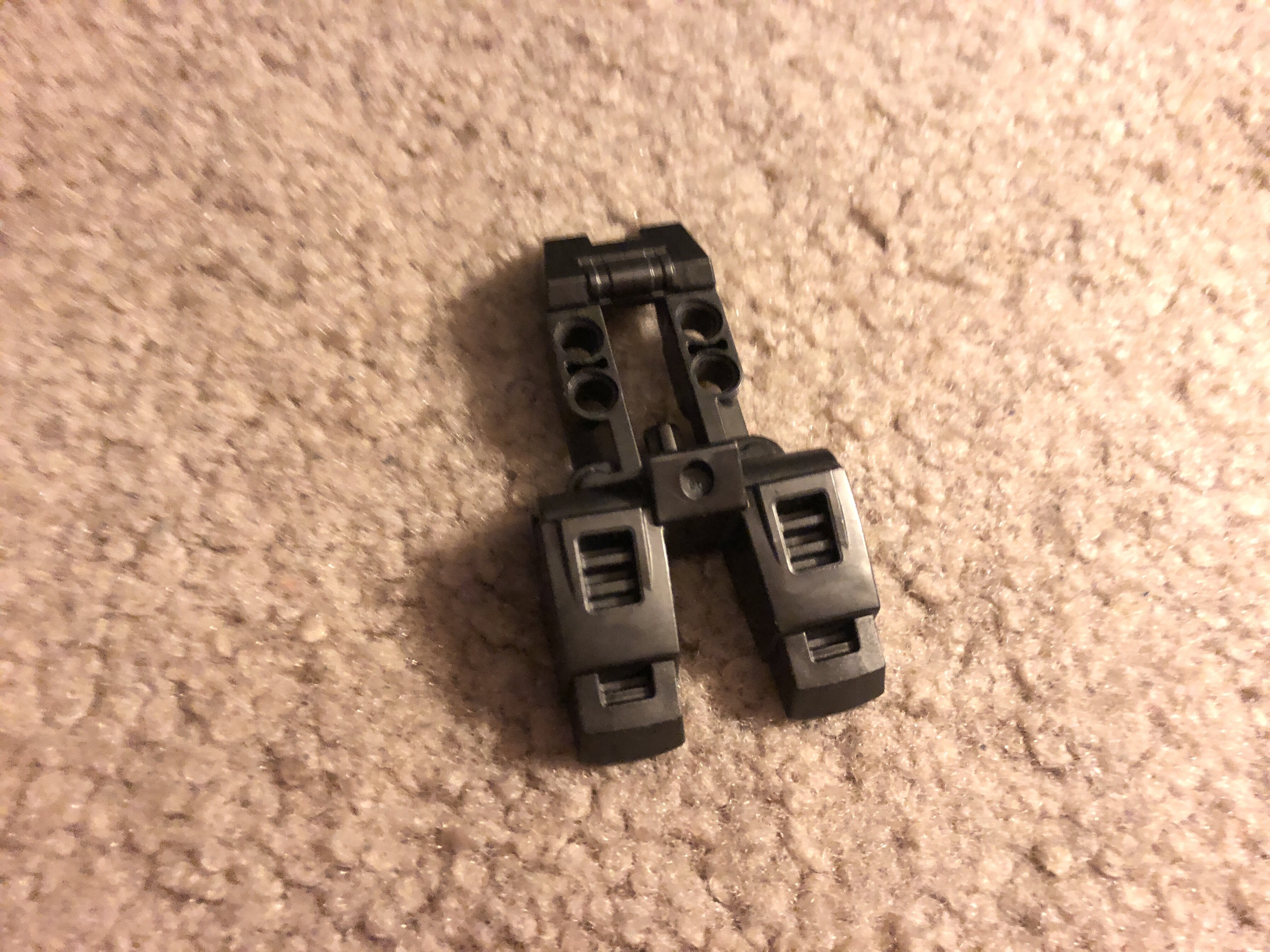

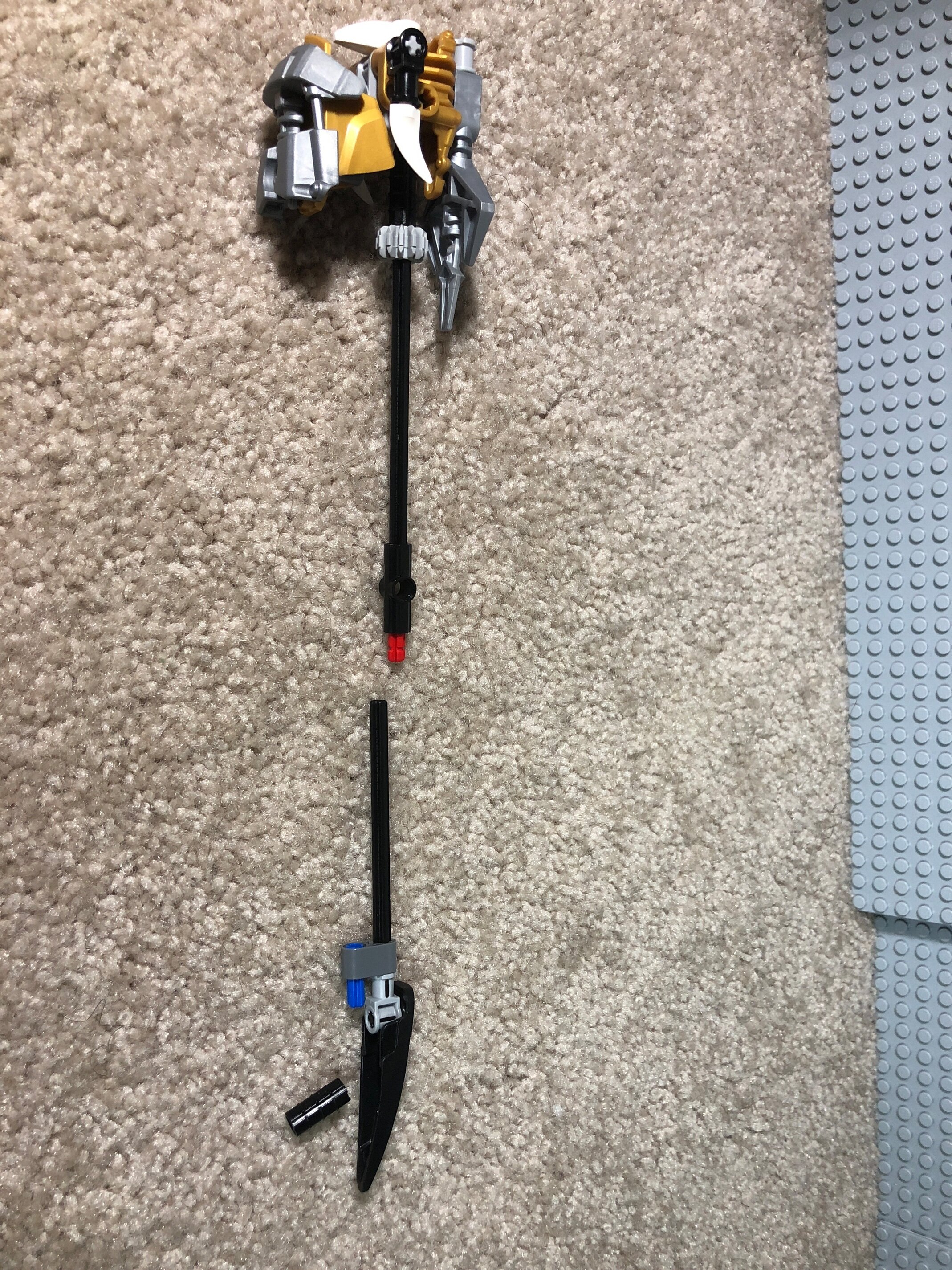
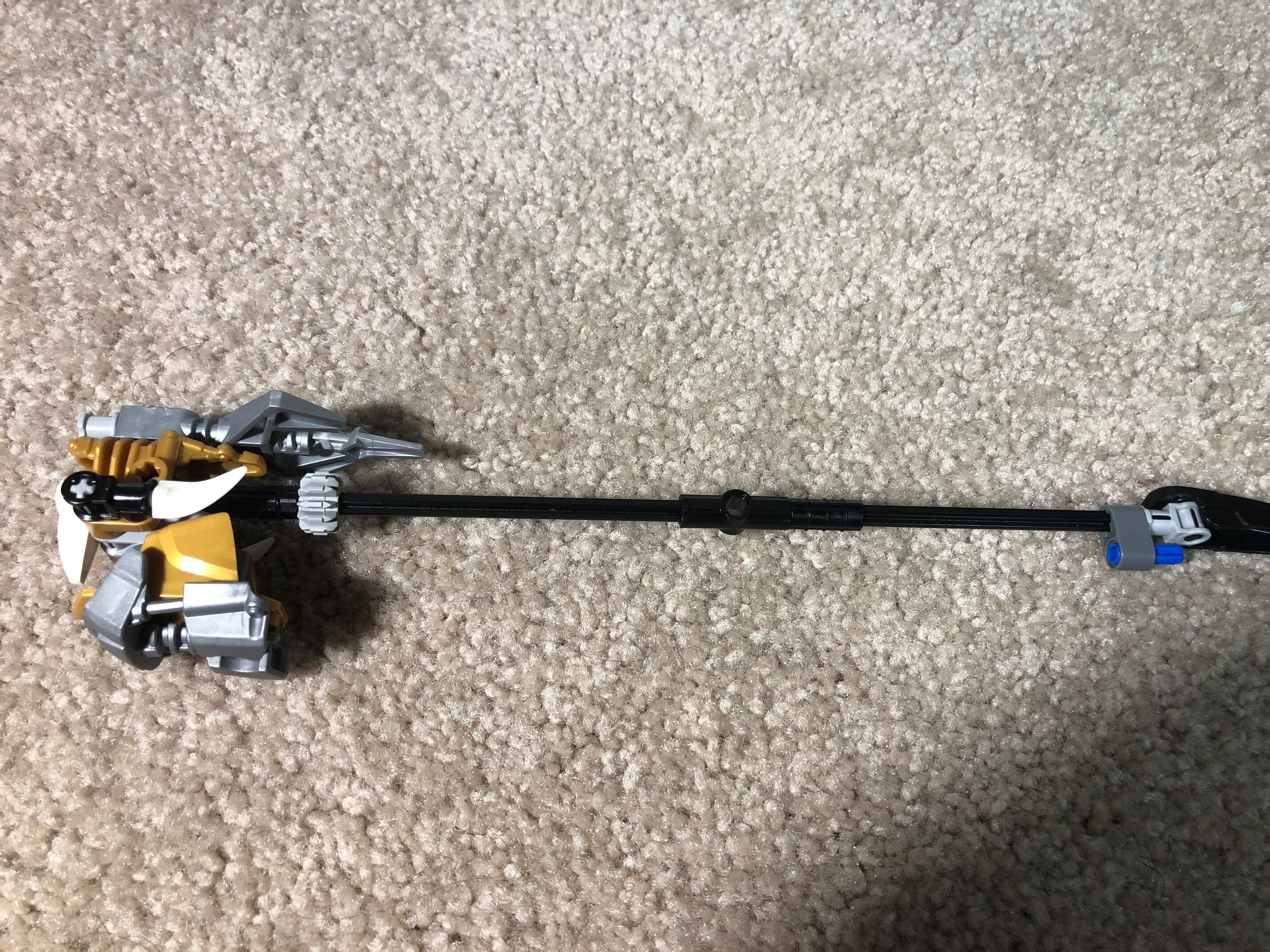

Unfortunately this piece is left out of the moc when the hammer is stored.
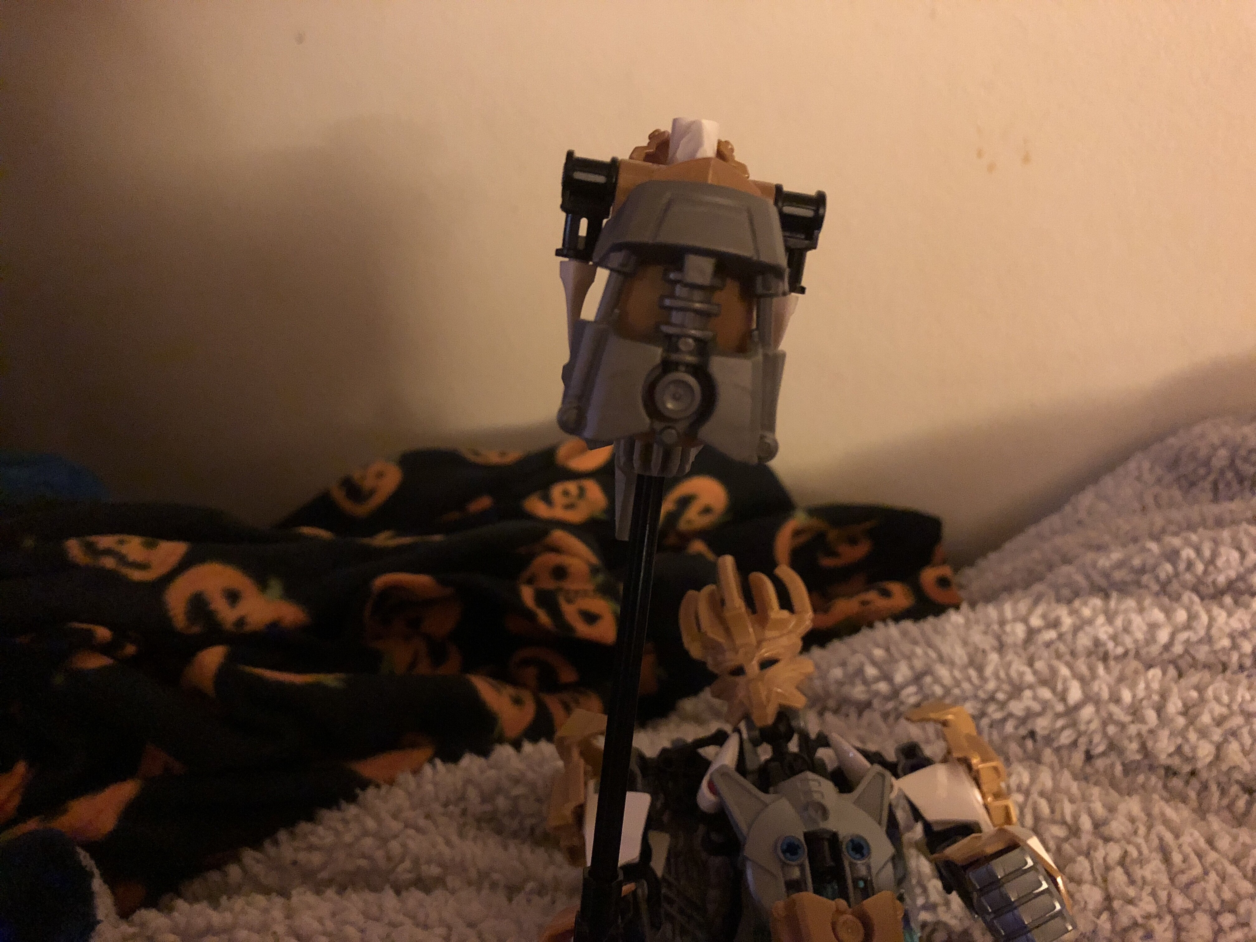
Also, is Artakha’s big hammer staff thing the staff of Artakha or his warhammer I don’t know which one I have him?
C&C is Apriciated!
Unfortunately this piece is left out of the moc when the hammer is stored.
C&C is Apriciated!
Nice MOC. Maybe try to update the back. I think it needs more work there
Thanks, but I don’t really know how I could improve the back
This is happening to me too
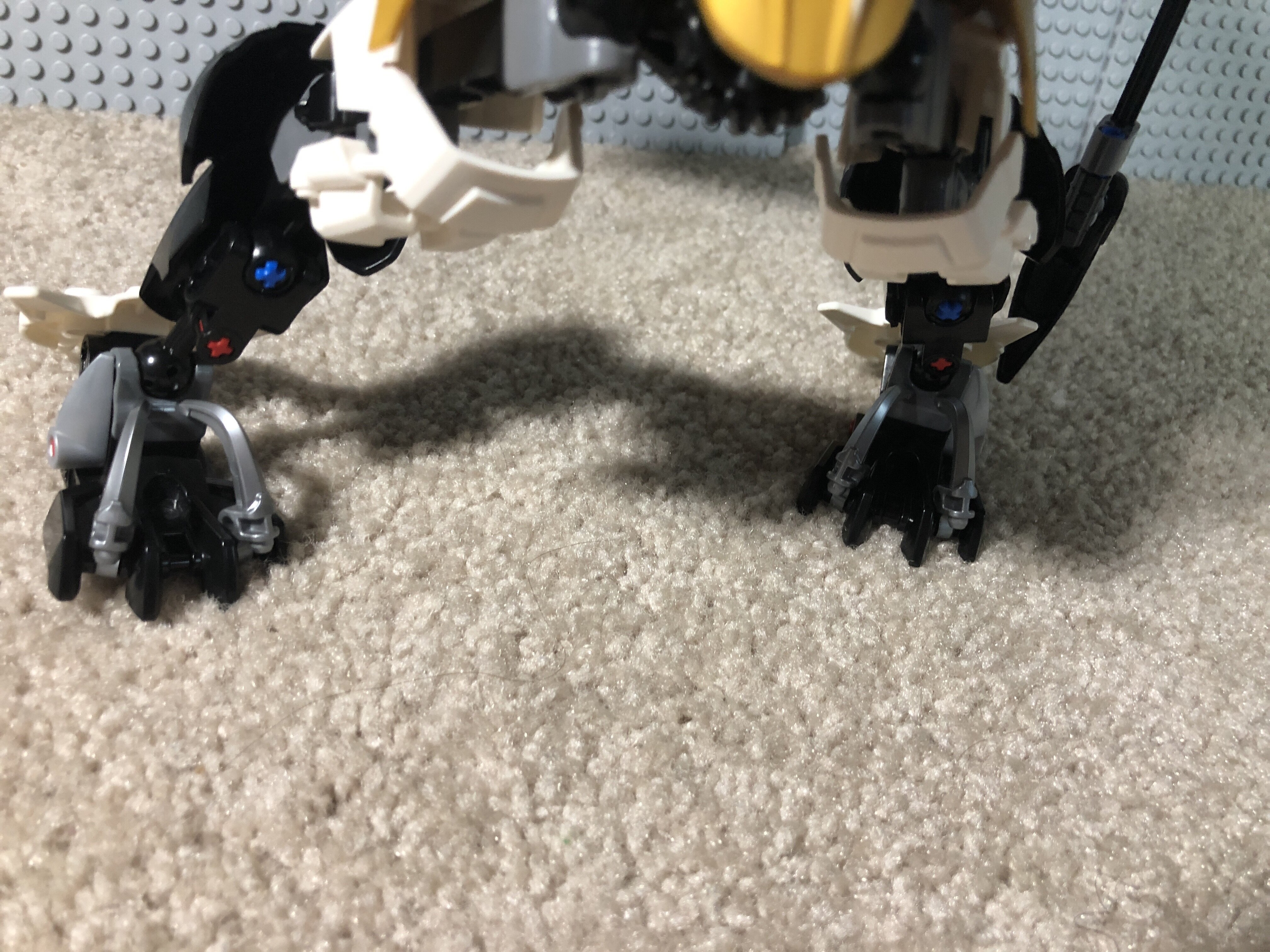
Got any more HF shields, or larger feet (the ones that don’t have a socket built into them)? Those wouldn’t stick out as much as the Skrall armor and would cover a bit more.
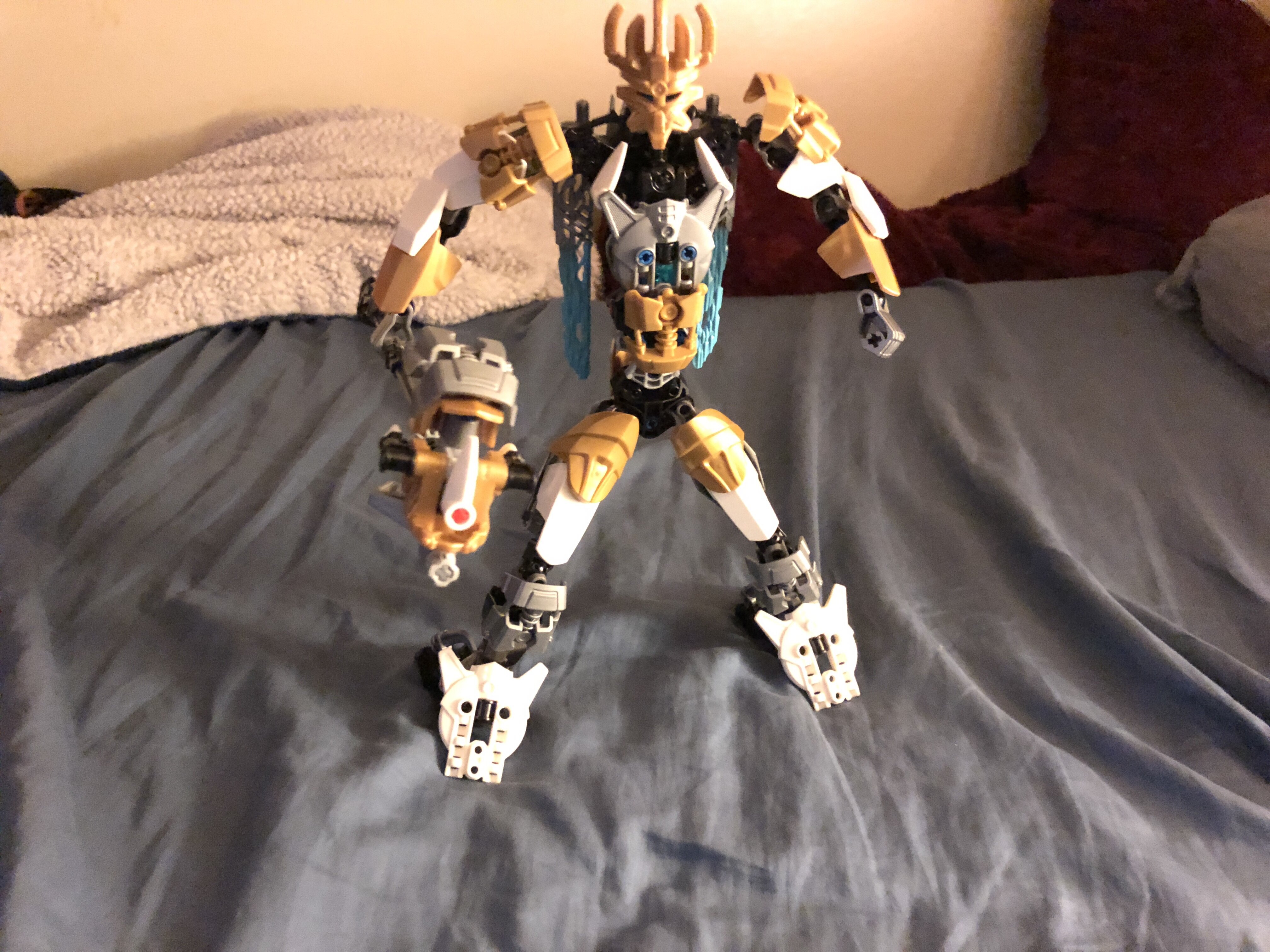
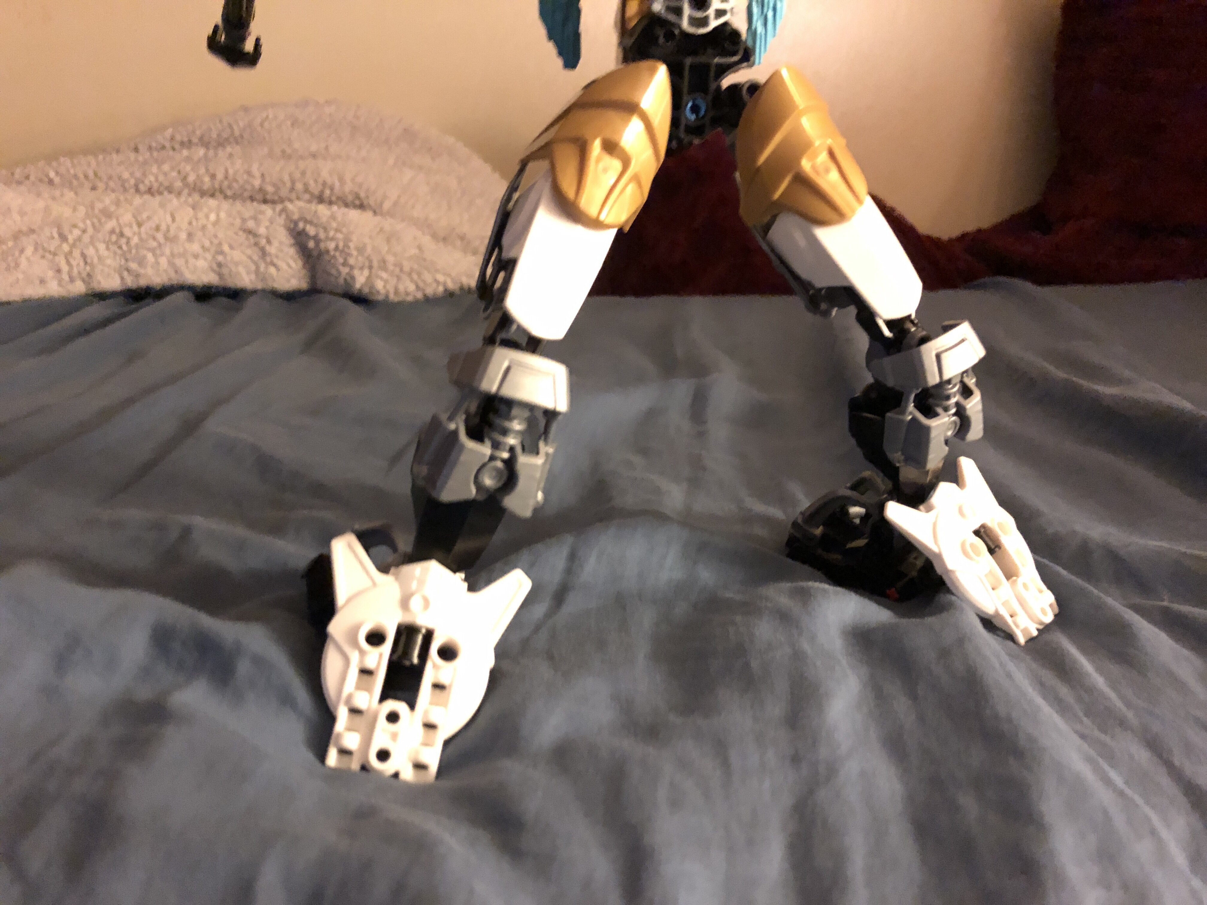
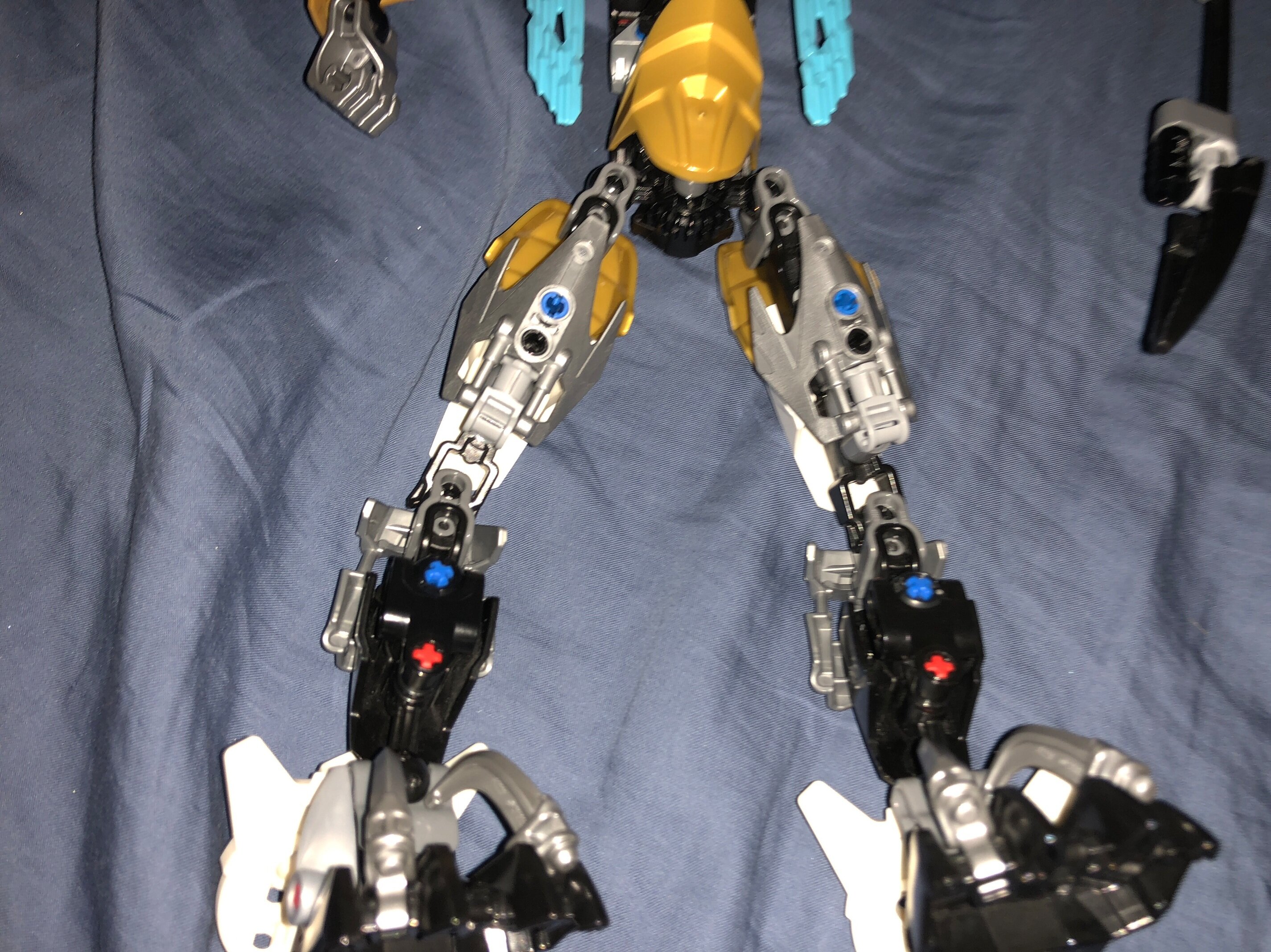
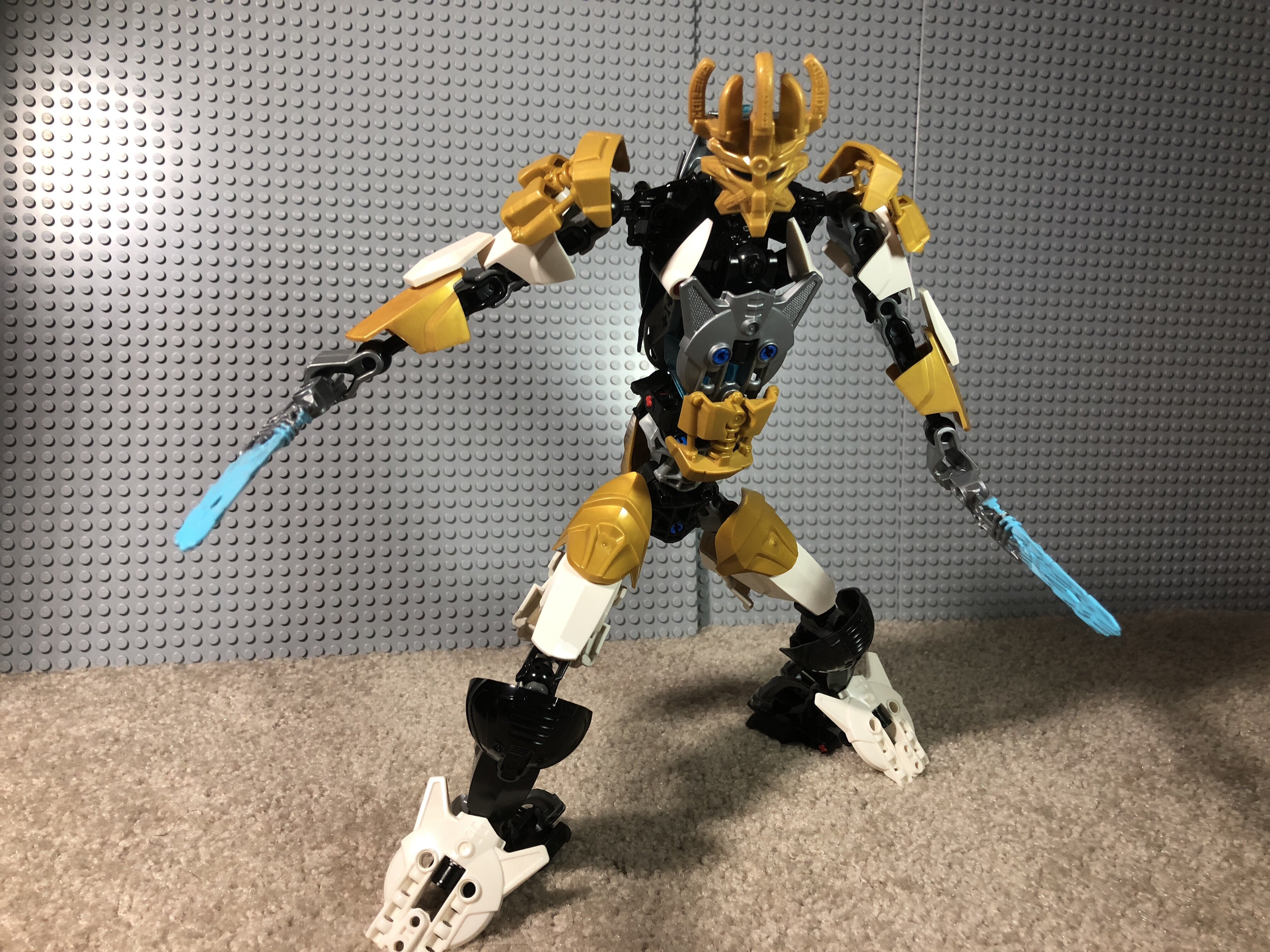
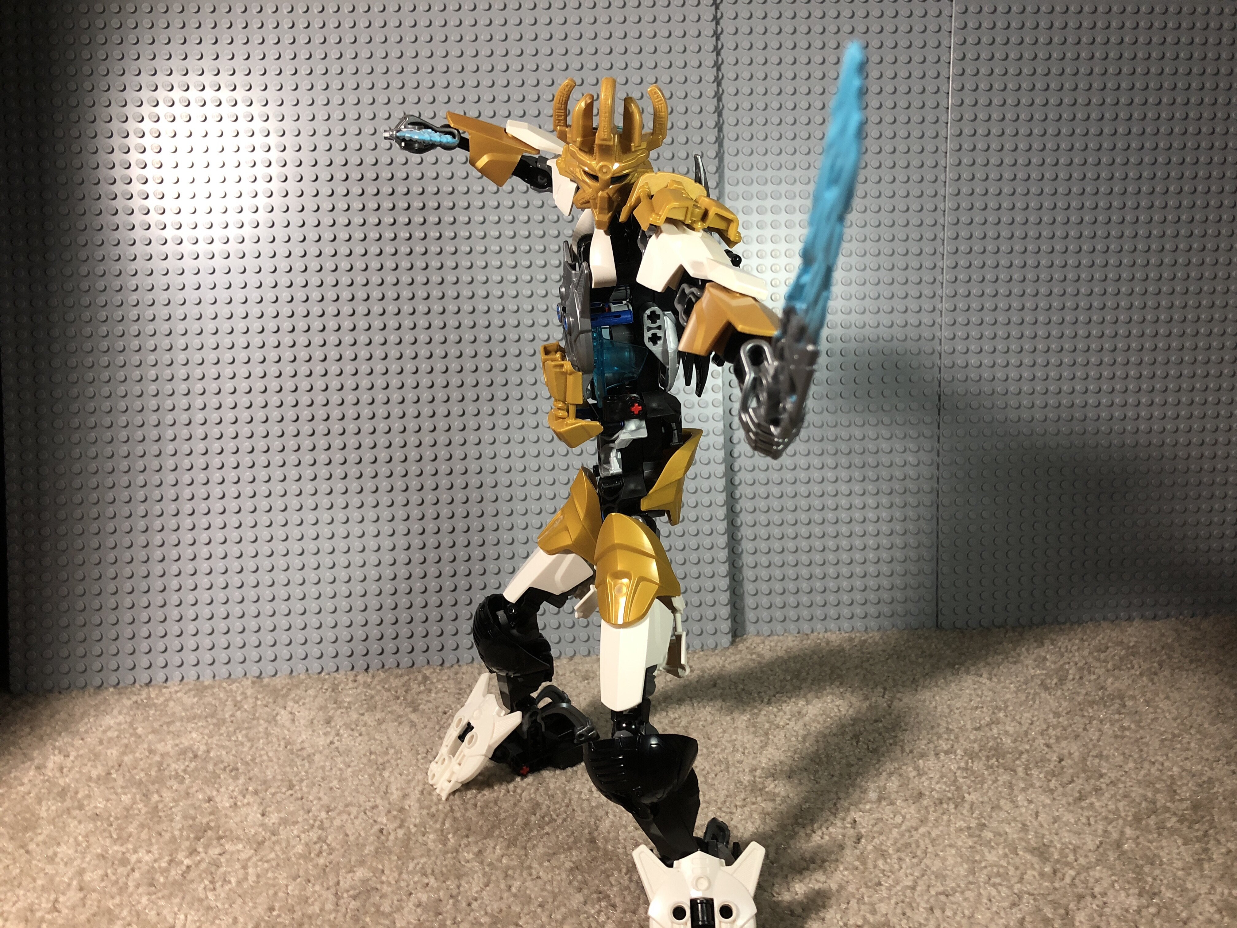
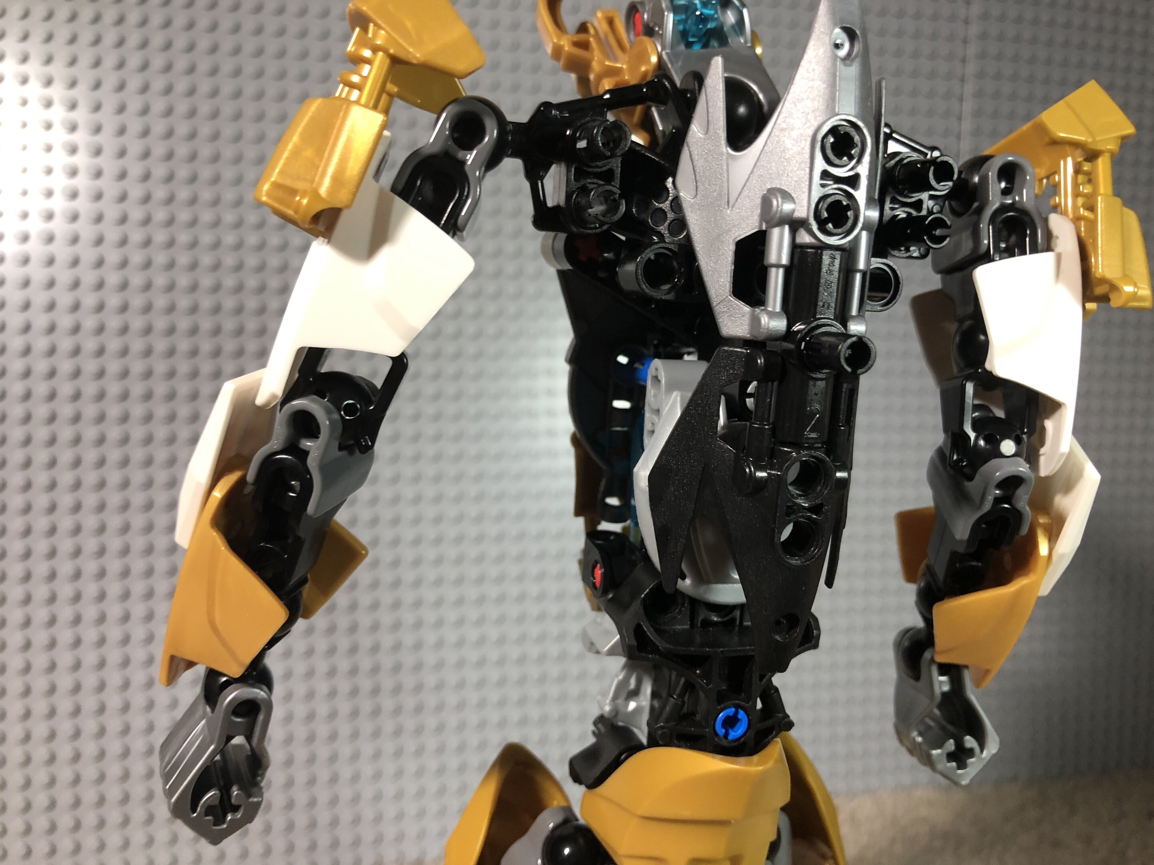
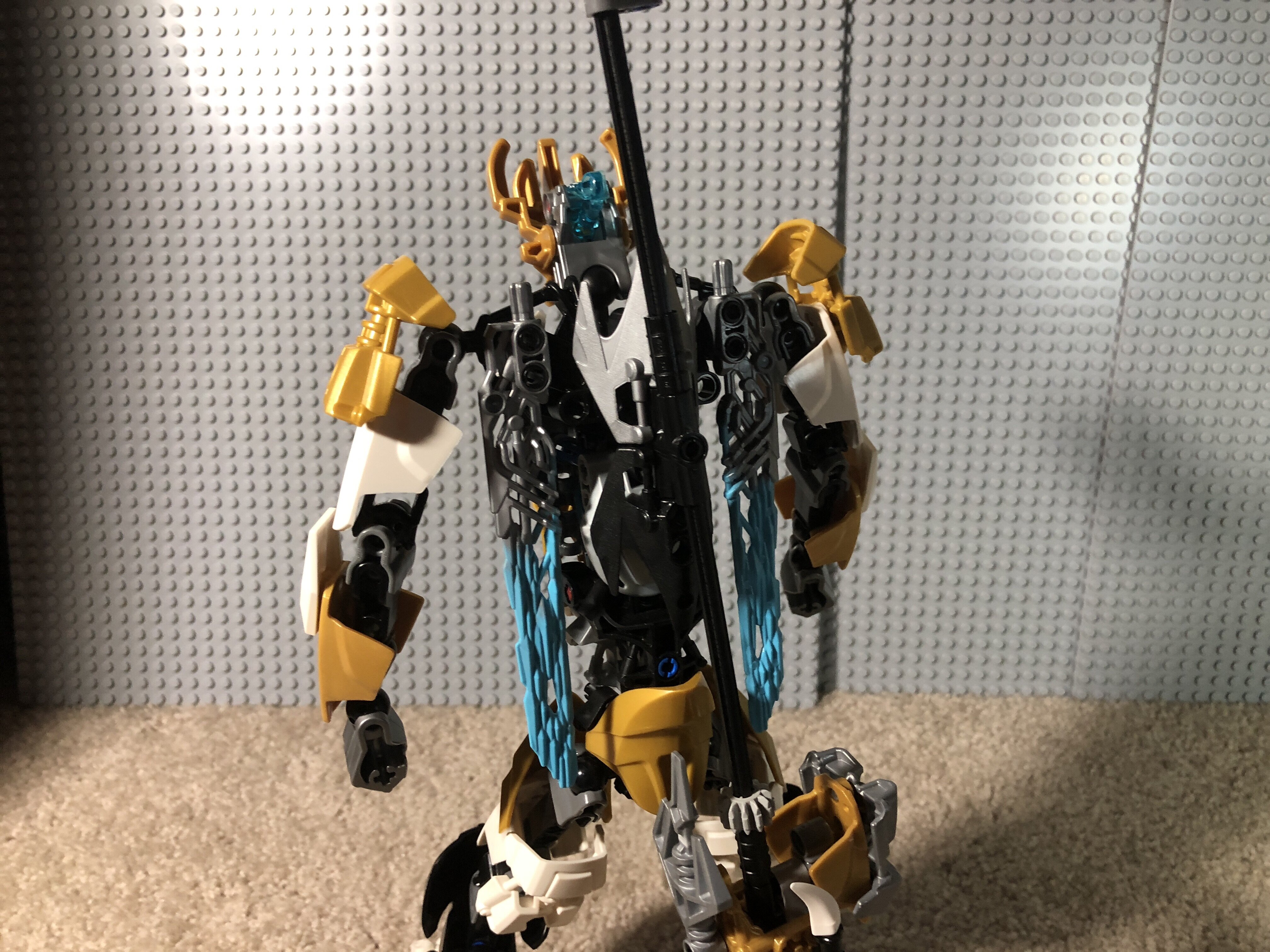
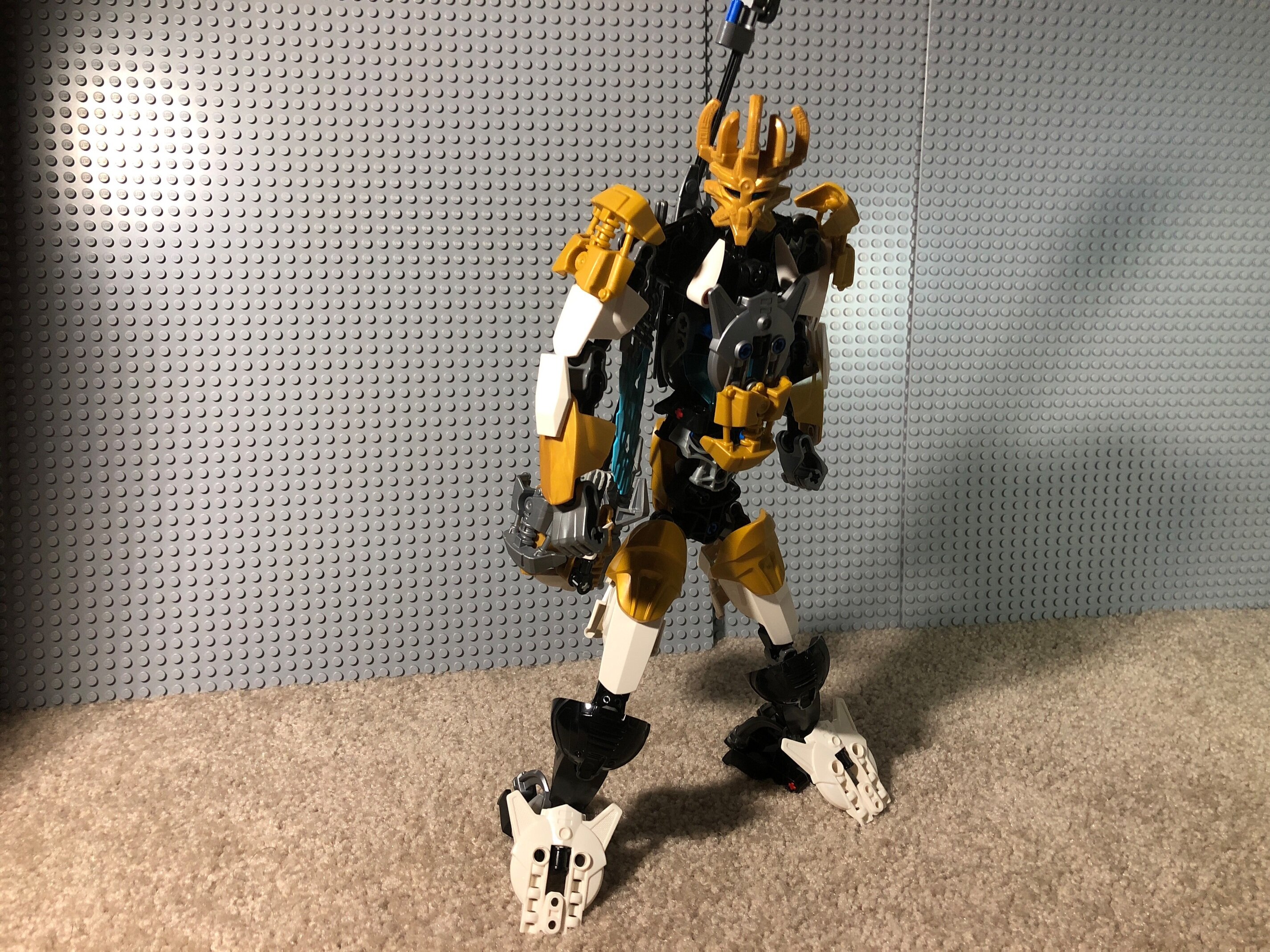
Anyway. I like the feet, reminds me of the designs of classic BIONICLE titans, and the front of the torso’s not bad, though it seems gappy under the chest. The torso is a bit too long though, should have it so that the wrist joints are lower than or on the same height as the hip joints. The white and gold armor is pretty consistent except for the all-black shins and the silver chestplate and skrall armor.
Thanks, but I only have the largest hf foot in gunmetal grey.
Don’t get mad at me, but I hate those legs. First off, the feet look extremely awkward. You don’t need to use custom feet everytime. I would actually have used the white Piraka feet. The lower legs are OK, I think, but I don’t like how those armour attachments look there. They are more specific for the shoulders. I would instead use the shoulder armour from the upper legs, which also looks awkward. The moc didn’t needed high-textured armour pieces on ‘invisible spots’ where nobody is looking at, like the back of the upper legs.
The torso looks too long and a new colour shows up: the silver. I would immediately change it with either black or white. But the fact that it is that long just makes the overall moc look awkward.
The arms are… meh. Arms. But they look too short comparative to the torso, and if you try to make them longer, you would only make the moc look more awkward, I think.
And yes, there are some blue and open pins, red axles and THAT TRANS BLUE PIECE. Oh my god, only one piece!
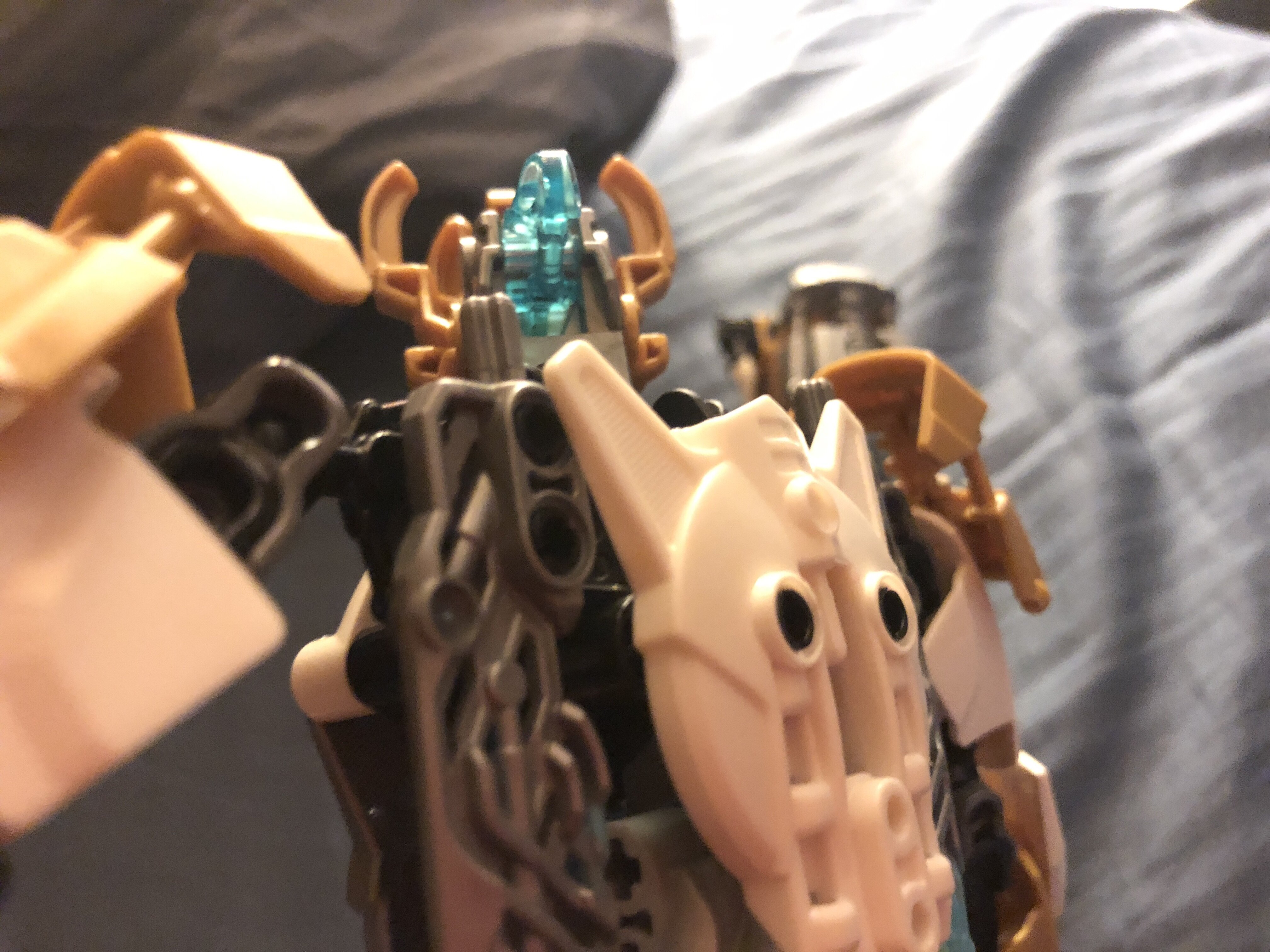
The eye socket is trans blue, and I wanted to go for a kind of “core” look. Besides there is silver on the legs, just in the back… where no one would… see… it…
See? You should change the silver.
At least I agree that the legs are a bit, awkward.
But I needed to do something with those feet because without them… he would be to top/back heavy and fall constantly
I understand, but again: the white Piraka feet seem to be the best choice for me.
He is right
Well, they add a little more silver, but:
A taller ekimu… that’s because of the mask and the gold.
And @Toa_Vladin should I call his staff hammer thing the staff of Artakha or Artakha’s warhammer?
Personally it doesn’t look like any of the two. The hammer part is too small for a hammer. The Staff of Artakha from G1 supposed to be a powerful weapon, a feared one, but this one doesn’t look powerful at all.
The torso seems to tall
Same. Sorry dude.
Even I can partially agree with that.