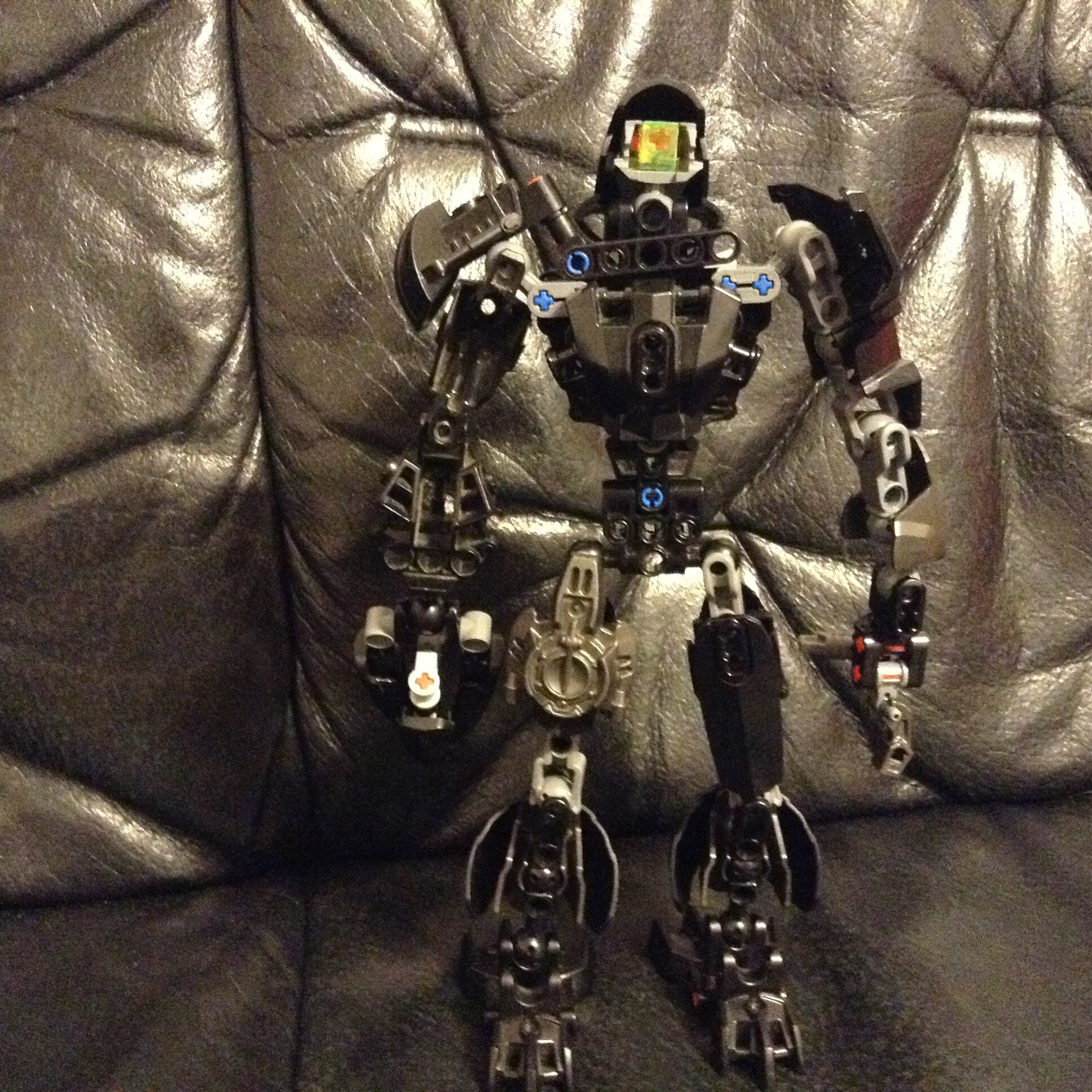
A very simple moc, with a boring colour scheme and nothing interesting at it. Let’s dig deeper into it.
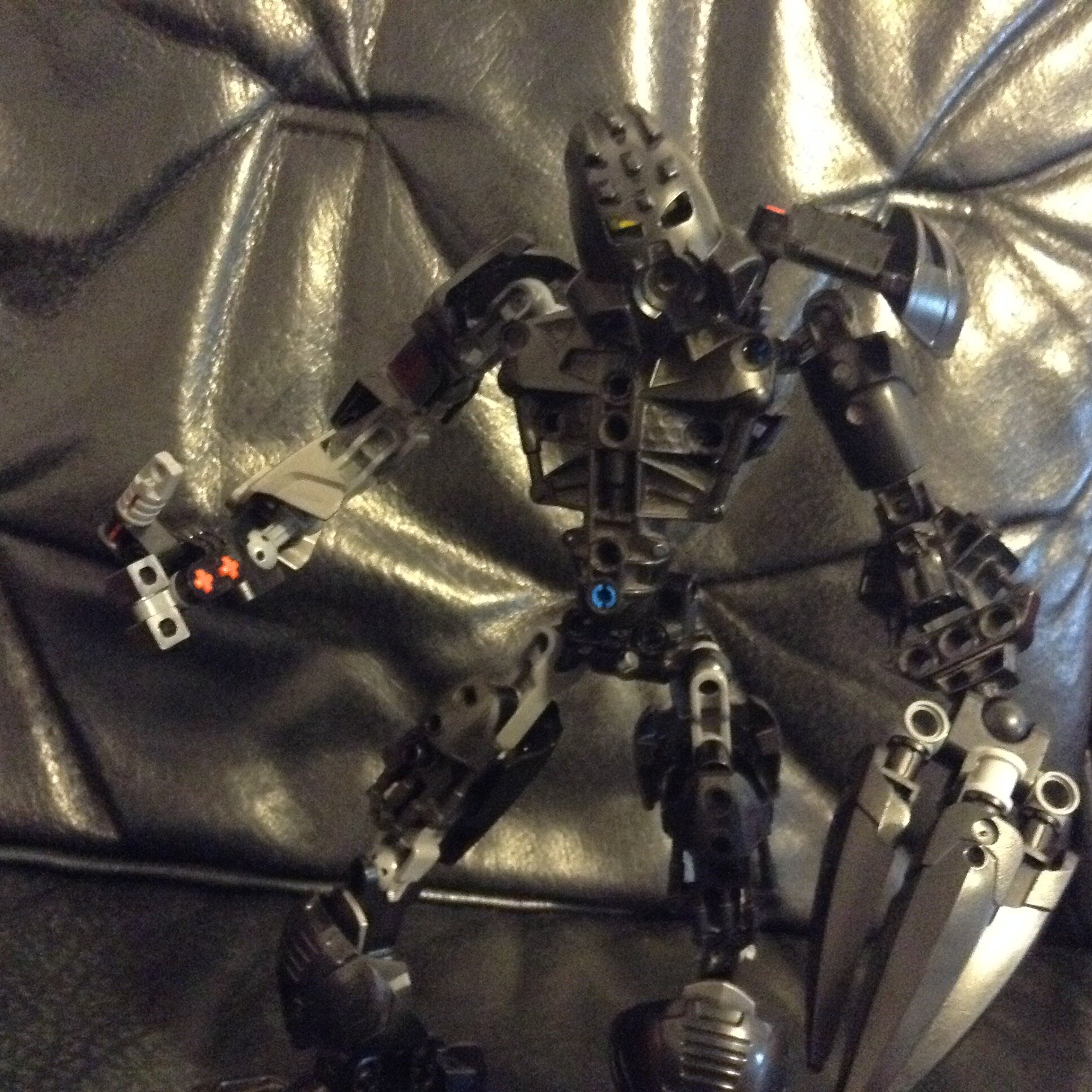
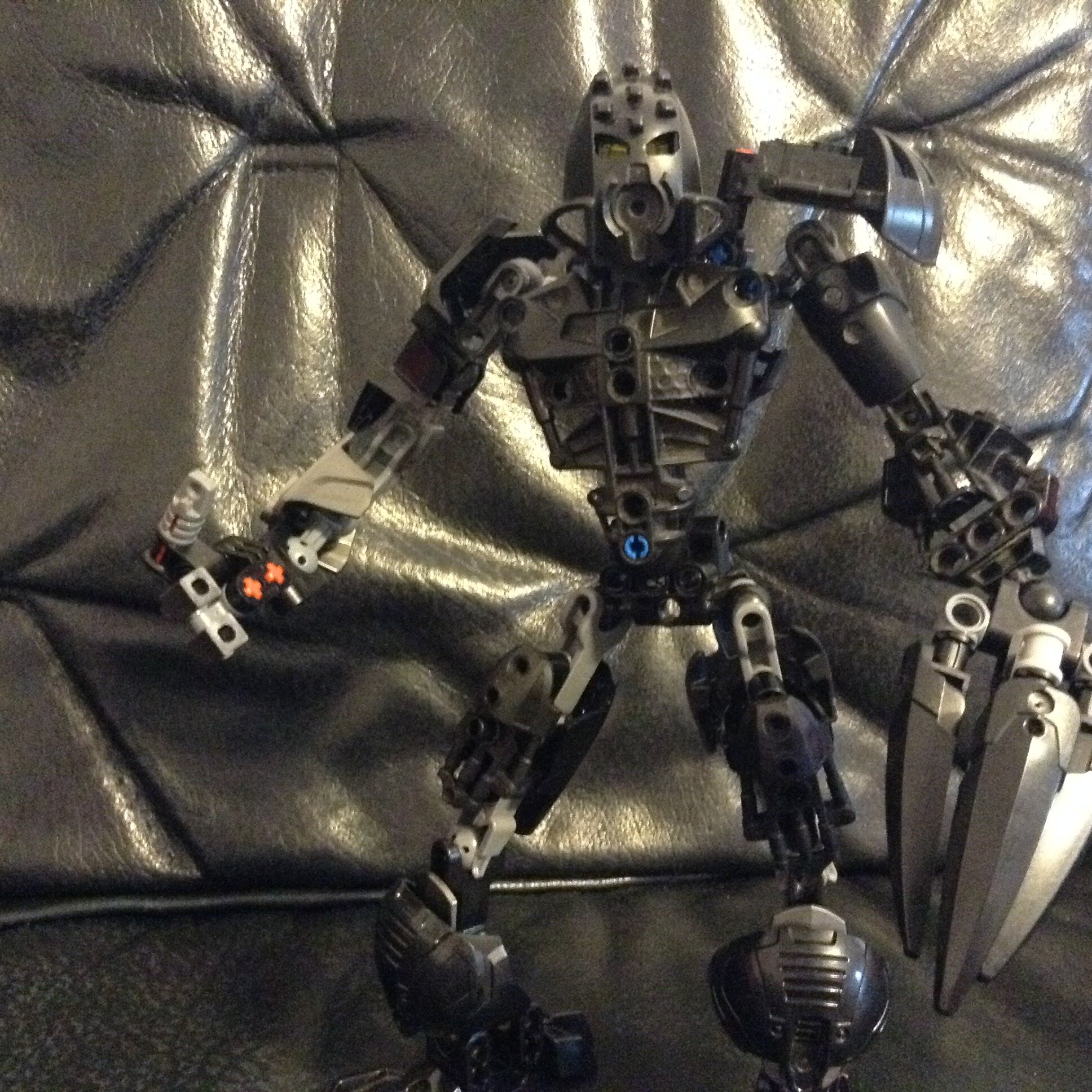
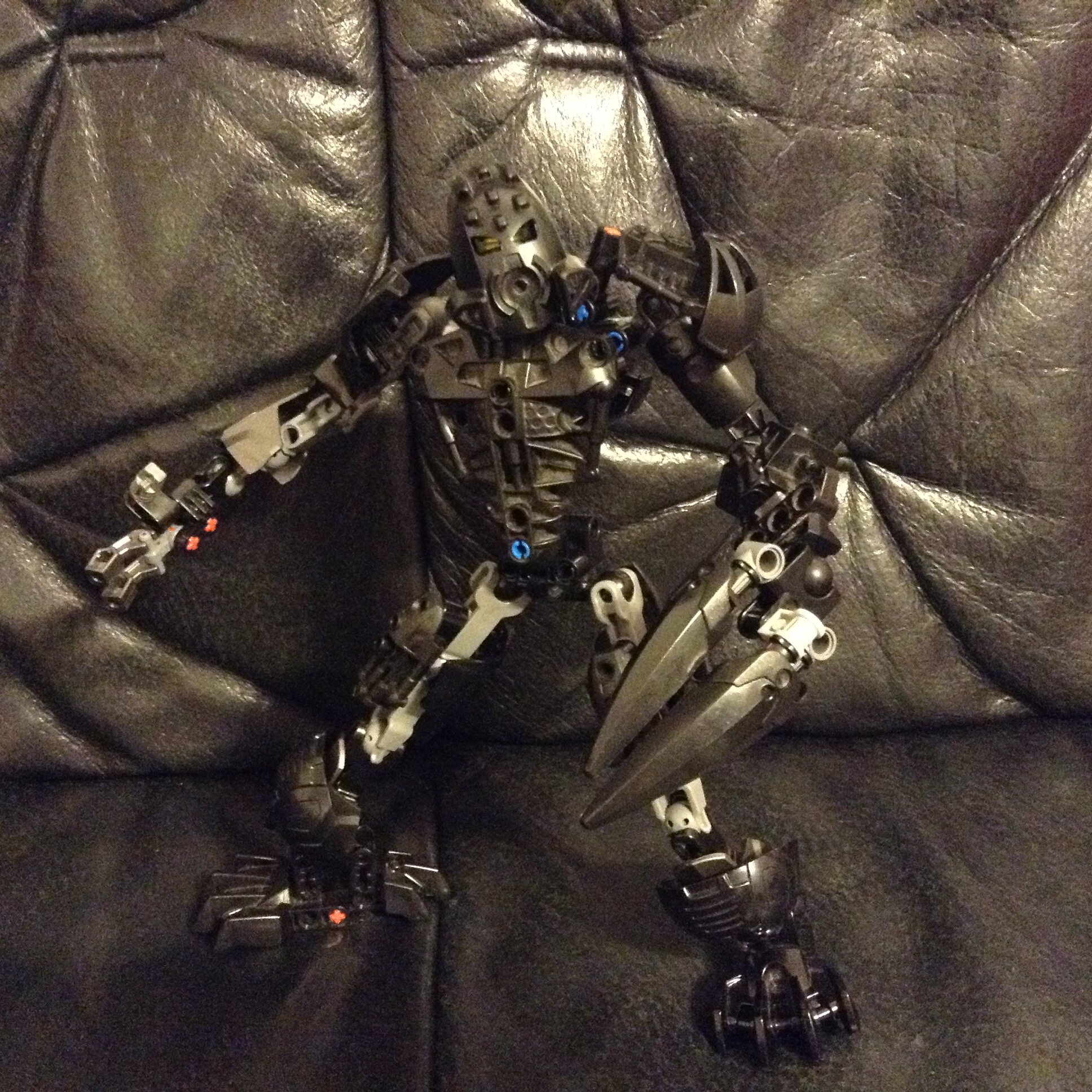
The legs are too long for that torso. They are also a-symmetrical in useless spots, like the back of the upper legs (Why?). The arms are… OK, and the torso is fine too. However, my biggest problem is in the colour scheme. I am not reffering at the blue pins and red axles. I am reffering that the whole moc is black, with some random lighter pieces. If you want to make a good moc, use a secondary colour and stick with it. In this case, I would have used grey, silver, gold, purple, or even dark green.
I am curious. Is he in the same team with your Toa of Lighting?
2 Likes
I didn’t thought about that. Maybe yes.
1 Like
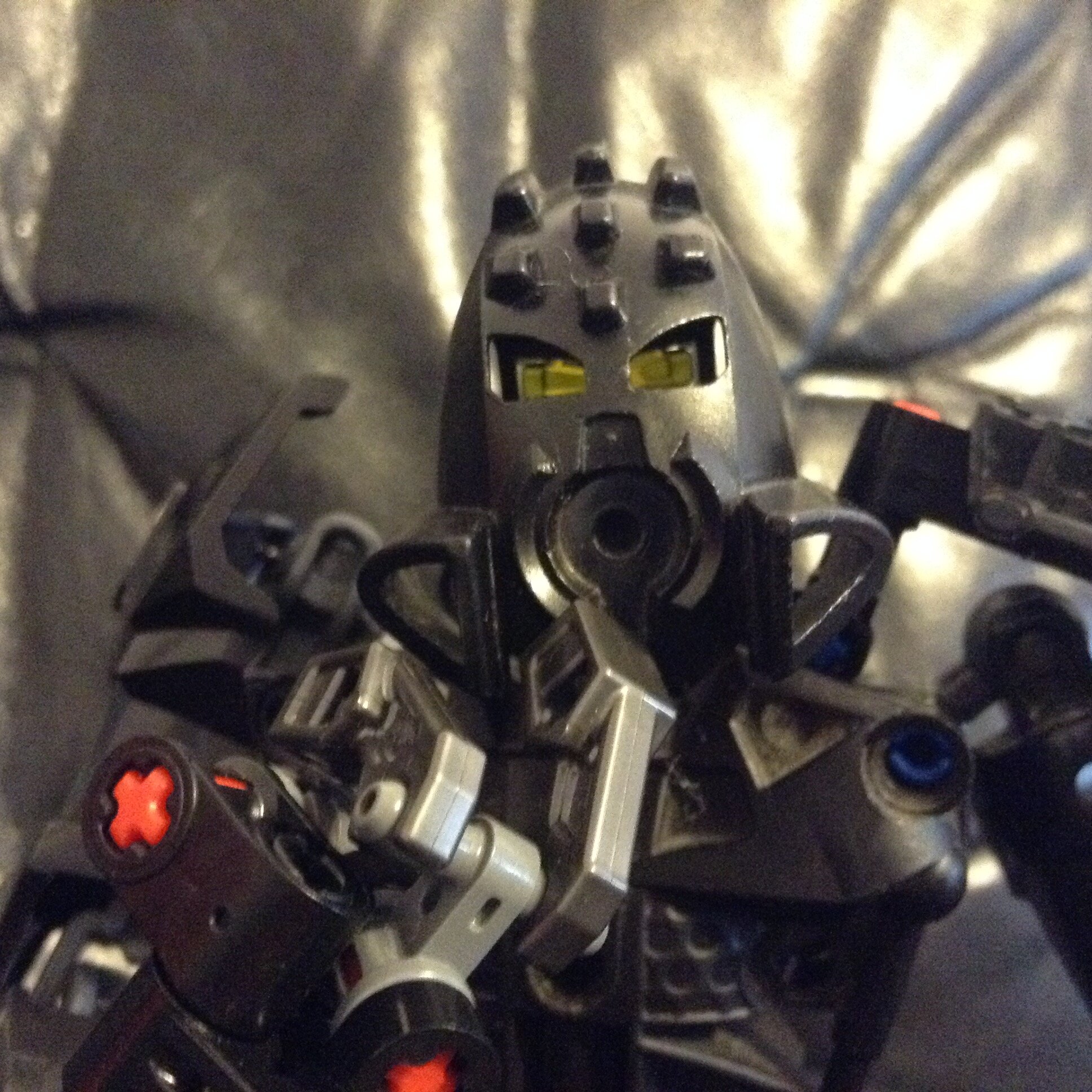
At least the claw is cool
1 Like
Thanks
1 Like
It would be interesting to see a full Toa Team.
1 Like
Yep. I thought about making teams earlier but not now. Maybe I will make the team. I will include Granu, the lighting toa, but in a new version
2 Likes
That name just poked into my head… I didn’t know what else could I name him
The feet, hands, and shoulders look cool! The black background is a little annoying, though. I like the name, Onua, Whenua, it just makes sense to me.
1 Like
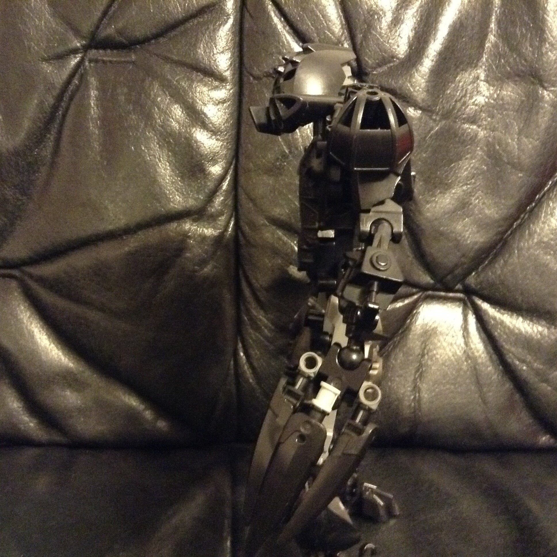
Thin limbs don’t really match the inherent stockiness of Inika chestplate-driven torsos. Not sure what’s going on in the thighs; and why they have the Inika armor on front and the CCBS shells in the back. Usually it works better the other way round.
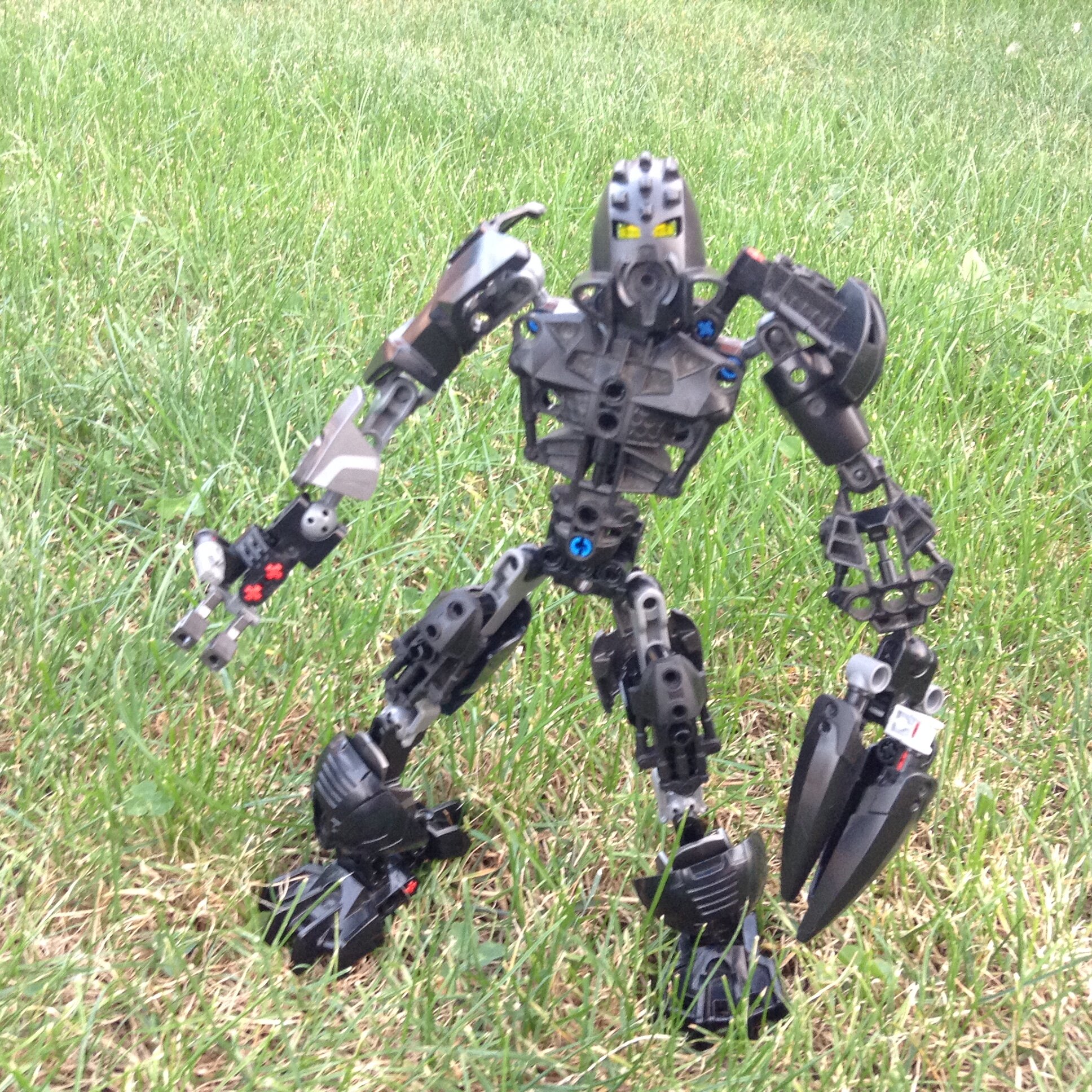
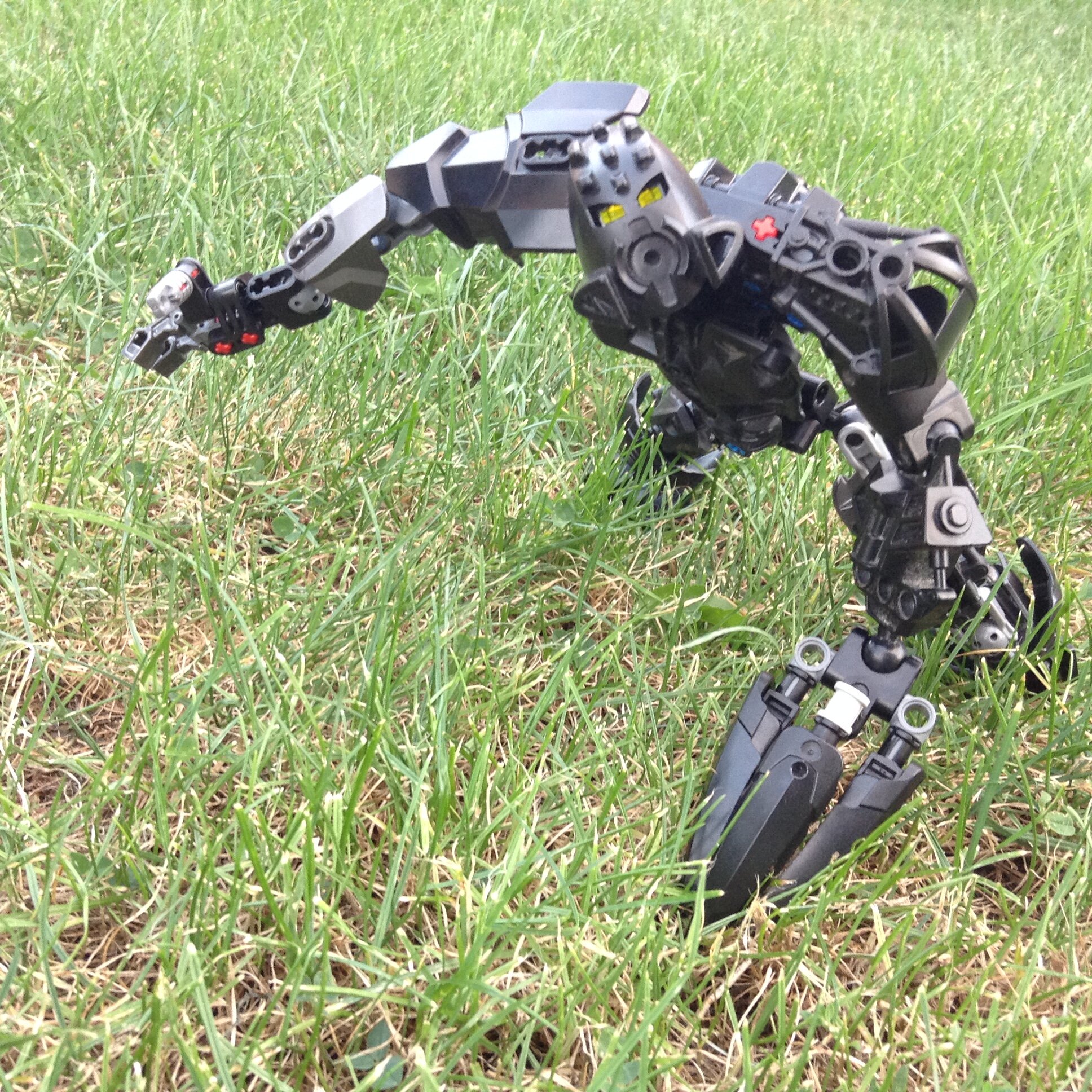
Very nice. I like the big claw hand.
your textures are clashing, smooth CCBS shouldn’t be with greebley technic bionicle
your shouler armor seems akward
1 Like