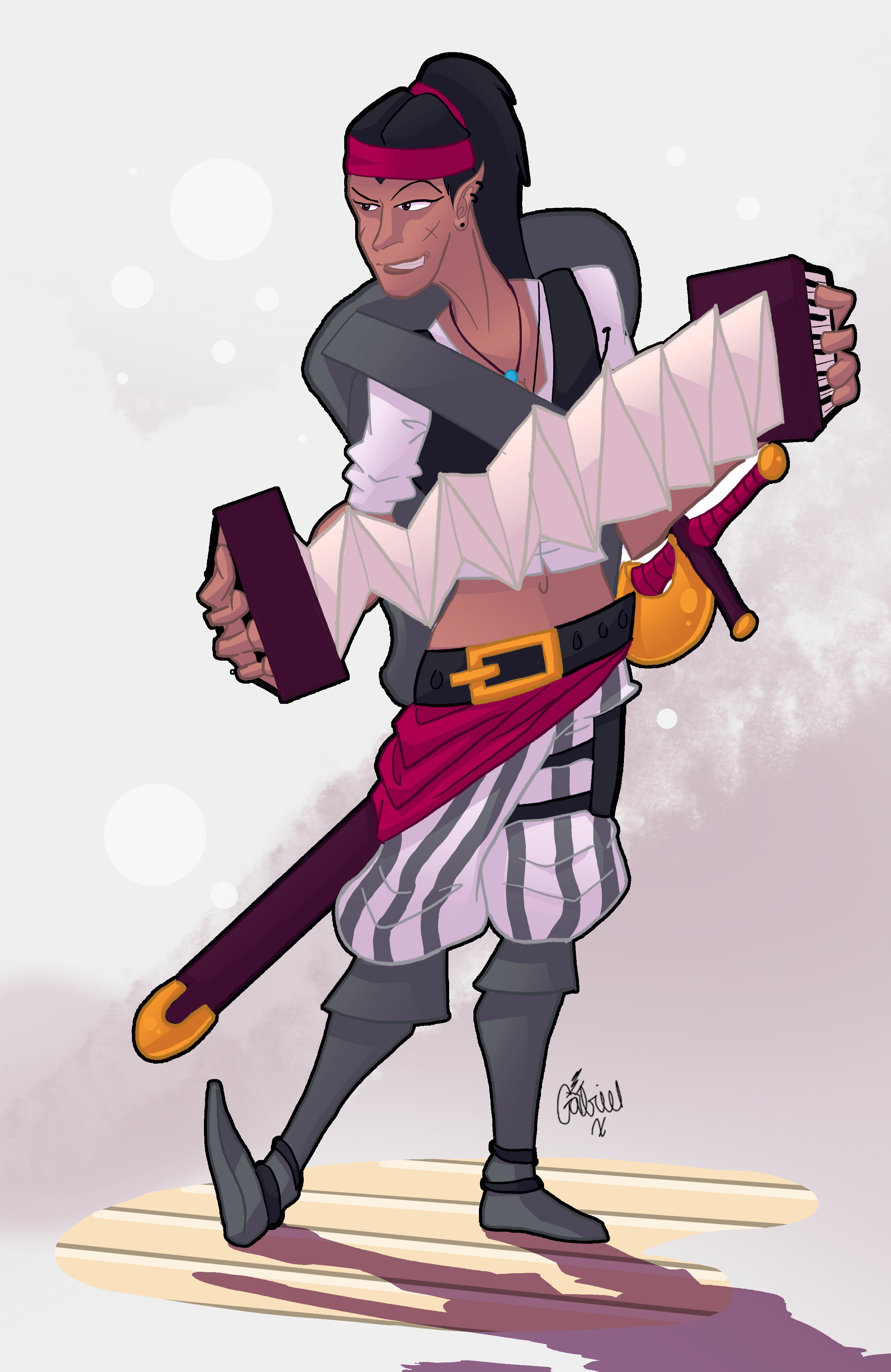
This is Syphira (Syph for short). She’s a wood elf bard and one of the latest additions to the Fools of Misfortune party.
Though a pirate by trade, Syph strives to uphold her thievery to some degree of moral standard, albeit in her own eccentric manner. Of course, she can’t do that without her trusty accordion, and a good old-fashioned shanty to go along with it.
Just watch out for the rum. That she likes to keep for herself.
This is a bit of character art I did on commission for a friend in the FoM campaign. I’m pretty happy with how it came out, though it took some difficulty to get there.
The jumping back and forth between light outlines and solid black ones is very apparent and detracts from the picture. More often that not, the light outlines break the flow of the image. Oh, and the extra thinner black outline in the middle of her hair stands out very much.
The trousers are the real highlight of the drawing. The light outline coupled with the darker one around the edges makes for a very good border, and the stripes follow the wrinkles and contours of the shaping properly and efficiently. The shadows on them are not overused, like in other parts of the drawing, and overall they’re really well drawn and click excellently with the black-bordered waistcloth.
Her neck is a bit too long, and her hands seem too big. Proper humanoids have the length of their hand nearly exact to the length of their face, from chin to hairline. Her hands seemed a bit too big to fit this, though. And improper humanoids can change things up for effective visual design, like Reinhardt from Overwatch.
Overall, it’s surprising to get such a good drawing on the boards. It needs a little bit more, but not too much. Keep up the good work!
Both were stylistic choices. I don’t know why, but large hands are appealing to me in a lot of art styles, and specifically here to emphasize the accordion. The neck I can sort of agree with, but again, the cartoon style isn’t meant to emulate proper proportions.
Thanks for the feedback, interaction is always appreciated!
The proportions are a bit off, but it works well with the cartoonish style.
The pose is a little awkward, I feel like the posing of the right leg is a little… inhuman.