That concept art looks really good (not as awesome as Matt Betteker’s but still awesome).
Can’t wait for more!
2 Likes
It’s hard to form an opinion without pictures of the front of the sets, and others that you can’t really figure out the entirety of the model.
4 Likes
I’m definitely seeing some interesting builds in the generals, but I have to agree with ThatchMac. The poster makes it hard to see the sets through the clutter.
2 Likes
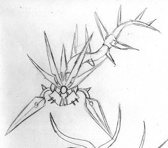
@Altair @ThatchMac @Novashii thanks a lot on the feedback guys. The following may help @Novashii and @ThatchMac for one of the sets ![]() :
:
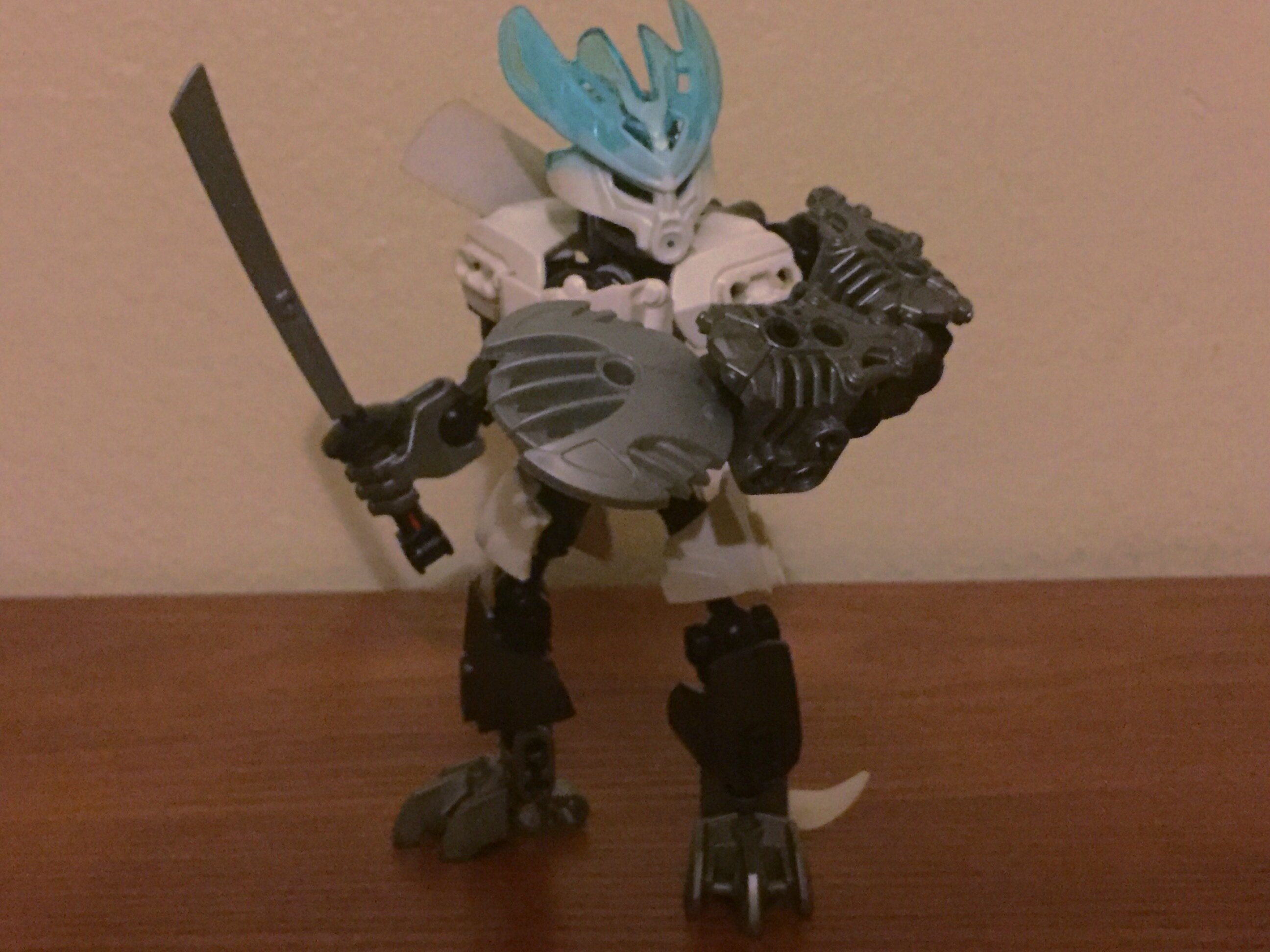
Hey guys here are the instructions of our first set: Tiakro, General of Fire

The mask is made by painting protector masks with 4 layers if acrylic paint, the colour is mandarin orange.
And here’s the parts list LEGO MOC Tiakro, General of Fire by Fanbyl | Rebrickable - Build with LEGO
Gives us feedback and post what you think of him.
More to follow.
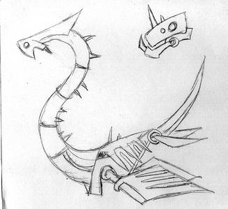
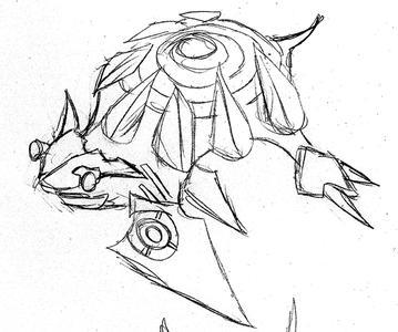
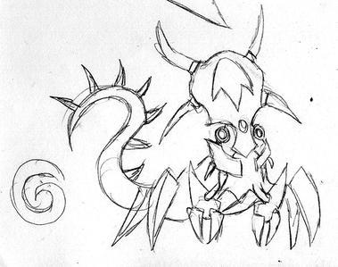
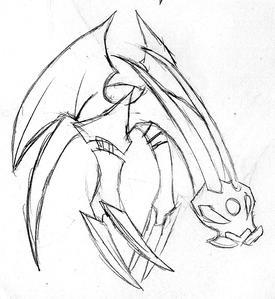
Also here’s the concept art:
So are you enjoying the project so far? Give us your thoughts as we always aim to improve!
12 Likes
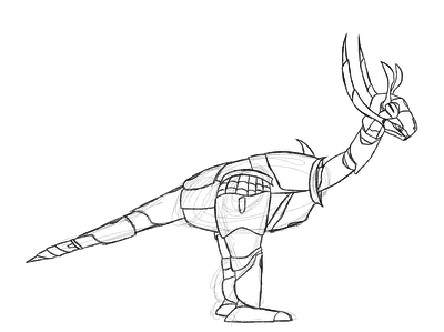
I just took a look at the PDF, and that torso design is epic! I also like how there’s knee and elbow articulation. It made me kinda sad when the protectors of 2015 sacrificed one or the other.
3 Likes
Man, that torso build… It’s pretty great!
I like basically everything about this guy, except for a few things. On the Torso there are two armor shells in different colors, which looks a bit strange, and the weapon is kinda whatever. I appreciate the painted mask, I think it was a nice choice.
2 Likes
Oh, woah. Yeah that does help. The finalized model really does look better. Overall I’d say it’s well done. Some thought was definitely put into the design (by the way the instruction quality is amazing they are VERY well done and VERY professional. For the model itself, I could say it doesn’t have any sort of action feature (shooting or gears) but I guess that’s not the point, and would make the figure look a little awkward. The only REAL problem I can say I have with it is that the weapon is a little lacking. It’s just a chain. A lot of the 2015 protectors had some pretty sweet weapon designs. But pretty decent figure. There’s nothing “stunning” about it but it’s definitely well done. The instruction books quality is BY FAR the best part that IS stunning. Overall:
7.9/10 On par with some of the 2015 Protectors.
Also the Youtube link never seems to work for me.
3 Likes
Still doesn’t work for me, I’ll try on a different computer.
2 Likes
I tried it (both before and after the change), and it just takes me to the Youtube main page.
The current one worked.
2 Likes
Yes, the current one worked for me as well. Thank you.
2 Likes
Eh, I can’t honestly say that I find this set spectacular. 7 colors is a wee bit too much, and while I’m all for asymmetry, it really needs to be carried out further for it to work. Also, that weapon seems a bit…difficult to use.
3 Likes
Ah, my mistake. Should have checked before I posted that. I normally wouldn’t count black, but since it’s used as armor on the shoulders, it becomes a more primary color.
Regardless, 6 colors is still a large amount to have on a character so small. The general rule of thumb I take is 3-4 colors (barring neutral undertones), depending on the size of the character. Any more that that, and I’ve found it begins to look cluttered.
4 Likes
We appreciate the feedback and we will pay more attention to the color skin of the sets in the next wave. There are reasons behind the colors in each set but I understand that from a purely aesthetic point of view the set/moc have too many colors.
5 Likes
Hey guys here are the instructions of our second set: Kaija, General of Ice
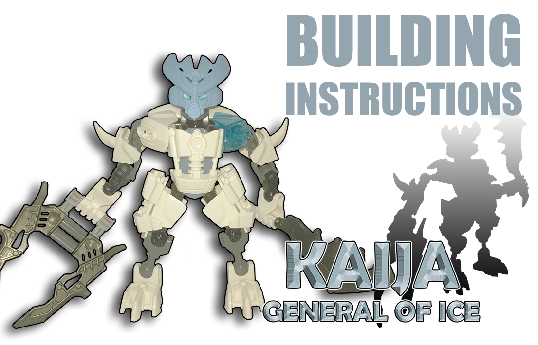
The mask is made by painting a protector mask with 4 layers of acrylic paint, the colour is light blue or blue sky
Give us feedback and post what you think of the set.
More to follow.
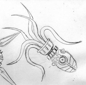
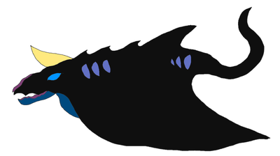
Also here’s some concept art:
18 Likes
I’ll review this one just like I did Tiakro.
Once again the quality of the instructions is fantastic and the custom build is very creative as well. But there are defiantly a few things that are off with he model. Firstly is the weapons, they feel fairly uninspired and could have been a good place for a function. The next issue is with the proportions, they are pretty weird. The shoulders are very thin a weak looking which could be fine but it is really mest up by the very wide hips. It just looks kinda awkward. The final issue is the color scheme which seems to be pretty lacking. The use of two different blues really jumbles everything and the grey bones especially make it feel boring. The head’s paint job is beautiful but is nearly the only sand blue part of the model aside from the hidden under-armor of the chest.
I won’t be complaining about the A-symmitry because it’s clearly a theme.
Overal: 6/10
(Also the concept art thus far has been AMAZING)
5 Likes
Your team is incredible; pristine work as always. The Bohrok eyes as traps are especially appreciated. I’m waiting to see all the generals, before giving formal feedback; that being said, so far, so good.
The splash page of the project wiki displays a small punctuation error; due to its protected status, I can’t directly edit it. In the phrase “…in it’s dying breath” (sic), the second word should be spelled without the apostrophe.
You know what I’m really looking forward to? The set design of Zelkriph. He looks pretty shockingly complex to me.
2 Likes

Any box art?
3 Likes
Curious concepts… I would also love to know what the paper or plastic element is on the right shoulder of the Kaija concept.
Are you guys planning on putting all sets on Rebrickable? Doing so would be greatly appreciated.
Keep working on it… I would pay for these if it was legal.
-Azani
2 Likes
I think that’s a white cape I got from a Mon Mothma minifig.
2 Likes