Wow, that´s even better.
2 Likes
Another idea that I think would be a good idea:
The toa were not originally a mantle for others to become. (I know lore isn’t established yet so I am go with the idea that the lore is more akin to G1) So something happened that forced Toa Helryx(the first toa) to make the decision to make the toa only be able to be a being when their mantle is worn. She also put great spirits(I’d rather refrain from using the name/word god) to guard and bestow the mantle to those worthy of becoming the toa and when needed to, make a new toa mantle when it is absolutely needed.
1 Like
I honestly don’t like the idea of Onua being so bulky, I always imagined him as a lithe figure, who could slip through small cracks in rock, and he had the mask of strength because of his apparent lack of physical strength. I honestly wanted Pohatu to be the bulky one, what with his mask of speed, to make up for the slow sluggish movements of someone with significant mass
1 Like
They definitely would. We used Axl’s body design because it’s the minifigure most akin to what we thought Onua would eventually look like. We didn’t want to create our own mold type without knowing any of the limitations that LEGO has.
In G1 he was the size of the other Toa, but in G2 I felt that his size difference really aided the character of a gentle giant by him being, well, giant. Different strokes for different folks, but I definitely think Onua’s design gives him enough uniqueness here to warrant using the Axlfig.
12 Likes
I suppose that is true, I don’t know maybe it’s my fantasy driven brain associating underground with claustrophobia, and dwarves
1 Like
Well, looking at the evidence we have, they created the axl body for a brand new theme for one specific character, I’d hazard a guess they could find it in the budget to remold the already existing design to better fit bionicle.
I think he means they don’t know too much about how to go about designing a new mold, not that there wouldn’t be one.
4 Likes
It can’t be that hard to approximate given Lego’s own molds.
I honestly have no idea. ![]()
I’m not suggesting an entirely new mold anyway, I’m suggesting they modify the Axl body to be more bionicle, change the more overtly nexo knights bits.
Quick question about the colors,
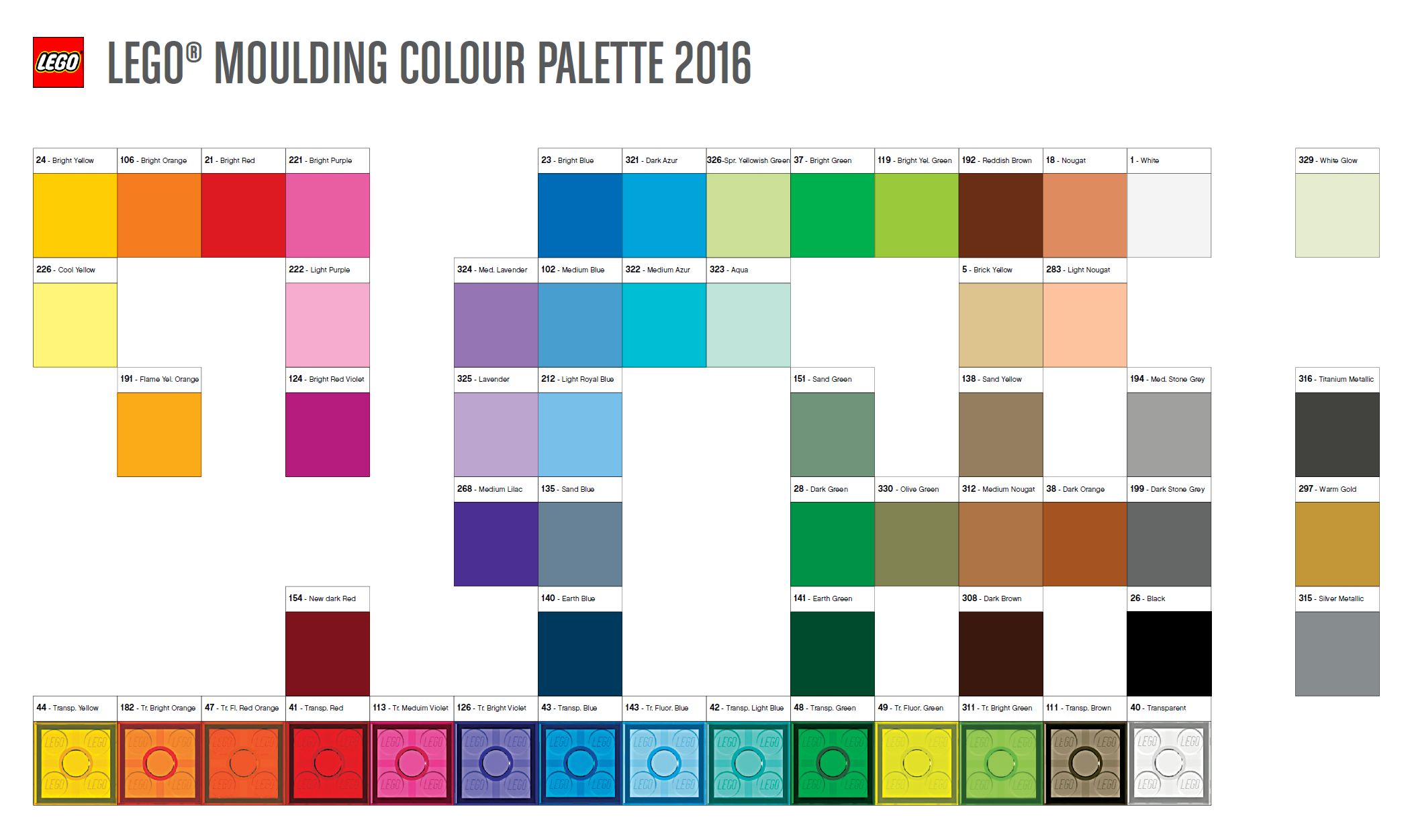
On the finalized art for the Toa, will they include the legitimate colors used by LEGO such as Medium Nougat/Dark Orange for Pohatu and Dark Green/Bright Green for Lewa?
5 Likes
That actually looks a lot better, in my opinion at least.
Also, all this talk about eyeholes keeps reminding me of that cereal in Rick and Morty…
I’m still firmly against the idea of making Bionicle a System theme, especially if it’s going to use regular minifig bodies, but these concepts definitely look cute and you clearly put a lot of work into them. With that said, there are plenty of design choices I’m not a fan of…
Tahu - he’s probably my favourite out of the bunch. With that said, personally, I’d replace orange with gold or yellow.
Kopaka - I like him, but I’m not too fond of the yellow eyes and Nuva symbol. I think they should be light blue or orange (if you really want them to stand out from the rest of the body that much).
Gali - I’m not a fan of her mask but that might be due to the fact it’s seemingly based on the 2015 Mask of Water and I didn’t like that one either, contrary to the popular opinion.
On the other hand, the colour scheme is great. The colours on the 2016 Gali were the only thing I liked about her and I love to see them reused here.
Lewa - I don’t like her design that much (and I hate the idea of turning any of the Toa Mata into a woman, it just feels like such a shallow and cheap way to fix the gender ratio in Bionicle), I’d even go as far as to say that she’s my least favourite figure out of all six. The green and white colour scheme, while original, looks pretty dull and not very energetic. The blue used for the eyes and Nuva symbol doesn’t help but maybe it’s because I’m biased against using bright green and bright blue together (I simply can’t stand it). If you’re so adamant about not using pink on Lewa (although I feel it work just fine), maybe try yellow?
I also don’t like the cape. I don’t think it works, neither visually (the tan doesn’t work with the rest of the colour), nor thematically. If you really want to differentiate Lewa from the rest by giving her a piece of cloth of some sort, maybe a butt-cape or skirt would be a better idea?
Pohatu - I love him. I think I would like him better if the eyes and the Nuva symbol were lime instead of yellow but I also know that the G2 Pohatu’s colour scheme was very unpopular. Also, if the pauldron is the piece I think it is, it’s a bit of a shame. I’d like it to be replaced with a new, Bionicle-styled mould.
Onua - I don’t like him very much. The colour scheme is alright (although I never really associated Onua with green beyond his eye colour) but it’s a shame that you opted for using Clay’s body instead of coming up with a new mould.
General thoughts: I don’t like the faces underneath the masks. There’s something really unsympathetic about them. I’m not sure what it is, but I’m gonna guess it’s the shape of their brow ridges and the slots in their cheeks being too prominent. Yes, I know, both these design aspects were taken from both G1 and G2 Bionicle heads but I just don’t feel it works with the cutesy aesthetics of regular Lego minifigs. I think you should go with something based on the Glatorian or HF heads instead.
All in all, it’s a promising project, but if I were you, I wouldn’t claim the designs are final yet, there’s still much room for improvement.
Axl, not Clay. Clay is the blue knight.
I like the little detail of Onua having little plant things on his body. Who else does?
It goes well with the new edits of the Earth element.
2 Likes
I don’t care too much about Nexo Knights but still, my bad. I guess there’s no need to edit that since you pointed it out.
1 Like
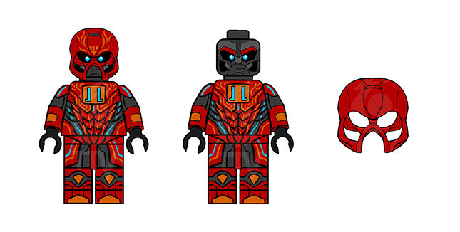
I have a few issues with these designs. First, a not so big problem. I’m kinda disappointed that the official Lego Color Palette wasn’t used here.
For some of the printed colors it’s acceptable, but all 6 of the main colors are shades not currently used by Lego. Tahu’s red is darker than Bright Red, Gali’s blue is an amalgam of 4 different shades, and no shades come even remotely close to anything on Onua’s arms. While this isn’t absolutely necessary, as this is concept art, it wouldn’t be difficult to change, and in my opinion be more realistic.
My other, more larger problem is the printing on the masks. I understand that the intricate printing on the torsos is largely based on the printing of Nexo Knights, and am totally okay with that. However, to my knowledge, we’ve never had such intricate printing on such irregular helmets before. NK and Ninjago have minimal, if any, printing on their helmets. Star Wars has had some intricate printing, e.g.
http://www.bricktoynews.com/wp-content/uploads/2016/03/LEGO-Star-Wars-2016-May-the-4th-Exclusive-Stormtrooper-Minifigure-e1458757956530.png
but almost always on relatively flat and even surfaces. These Kanohi designs are incredibly cool, but printing on them would be a nightmare.
Also, I agree that Lewa’s cape could be a little more interesting. Something like Batman or Cragger would be interesting to see.
Otherwise, I think these designs capture the essence of Bionicle rather well, especially Onua.
18 Likes
Shovel Knight! I had that in mind when I thought of that. Yet, I still think a hammer for Pohatu would be better. Uniter Onua´s drill already happened, redundancy I guess.
1 Like
No clue if this has been mentioned already, but the amount of prints and specialized techniques on these figures is ridiculous.
One of the most detailed minifigures ever, the Silver Centurion, has close to as many prints and dual molds as these do.

These are some very nice designs (albeit Onua doesn’t use the same technique Axl does in using a large helmet to fill up the gap made by the larger torso), but it must be kept in mind that this is for a Lego theme which has many limitations on what it can use.
I bring up the Silver Centurion because that was a preorder exclusive and never sold in any sets, as to point out that they’ve never released something with this kind of printing in a normal set.
Since this is an action theme, let’s just look at a modern Nexo Knights figure.

This is from last year, but frankly there’s little difference. This figure has printing on the legs, pelvis, torso, back, and head. In addition, it has a dual molded torso piece shared by every Nexo Knight in 2016.
I’m going to use Tahu as a comparison since they both have the same role of “good guy leader” in both series (unless you’re completely changing the characters).
This figure has: printing on the legs, printing on the torso, printed presumably on the back, printing on the arms, dual molding on the arms (since Lego’s printing techniques can’t reach that far around the arm), printing on the pelvis, printing on the head, and printing on the mask. I’m not sure about printing on the sides of the legs but I wouldn’t be surprised considering the entire figure is covered in printed detail.
Point being, this level of detail is not far from what Lego used for a game preorder exclusive never sold at retail (without the addition of a dual molded torso piece and printed 1X1 tile, though it could be said that a few of these figures have custom cloth parts with prints), and it’s simply too much for a single minifigure sold at retail. I’ve nothing against most of the design choices, and I’d love to see them in a realistic form (not to mention I’d absolutely buy them, but that’s disregarding the cost), but as of now they simply have too much detail for a single minifigure sold at retail.
Based on the figures of old, I think Lego uses tampography (or once did), which means that every new color is a new print and is kind of susceptible to failure. I don’t have a modern example of this (though a few older ones, say, late 90’s), thankfully, but the amount of colors and specific details concerns me a bit.
Also, just going to mention that some of the arm printing isn’t possible with Lego’s current techniques. I don’t think I’ve ever seen a minifigure with printing that wraps that tightly around the arm.
Also, just going to echo a few opinions from some people I was talking to about this; new molds for Onua would be pretty cool, and that the shield on Onua’s chest is a bit odd. This is all personal preference, however.
12 Likes
You have a point. But, are these going to be real figures? I don´t think so. Yes, consistency is a thing, yet if these things won´t get made, there´s no boundaries to design.
1 Like